Michaels Credit Card
I led the creative direction for Michaels’ first-ever credit card, developing a premium visual system that felt modern, trustworthy, and unmistakably Michaels.
My Role
I was responsible for developing the campaign look and feel, spanning conceptual exploration through final execution across digital, print, packaging, and in-store environments.
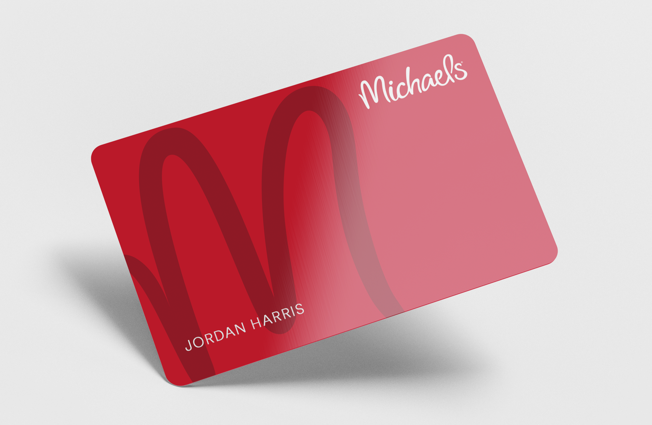
Designed the credit card, full design system, and visual variations
Art directed the campaign photoshoot (styling, talent, and tone)
Developed digital, print, and social assets
Created a scalable toolkit for cross-team production
The Approach
I built an identity using the iconic oversized “M” from the Michaels logo. Using a minimal palette, bold typography, and a clean composition, I created a campaign that stands out amongst other Michaels marketing campaigns and initiatives.
The Result
A cohesive, elevated launch identity that distinguished Michaels in a crowded retail credit space and set the foundation for future card promotions.
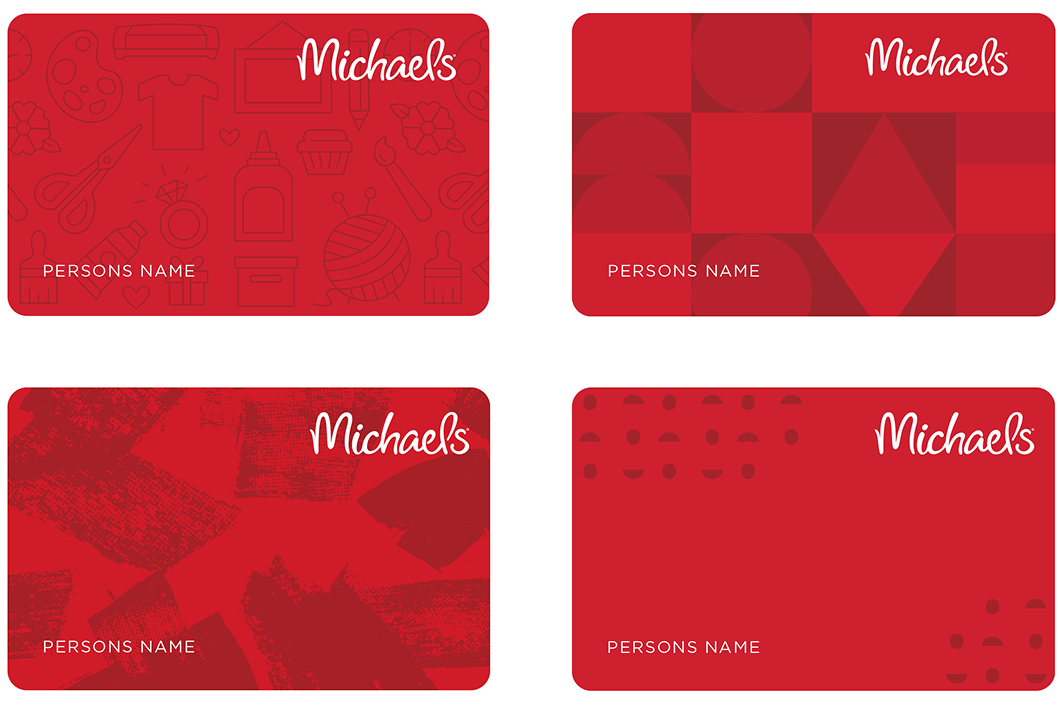
The Concepts
Before landing on the final direction, I explored a range of conceptual routes that highlighted different facets of the Michaels brand: concepts rooted in arts-and-crafts textures and materials, ideas influenced by Michaels Rewards branding, and more graphic explorations based on color, forms, and patterns
The chosen direction centers on a bold, graphic “M” pattern derived from the Michaels logo. It becomes both a recognizable brand asset and a flexible design system that easily adapts to digital and physical formats.

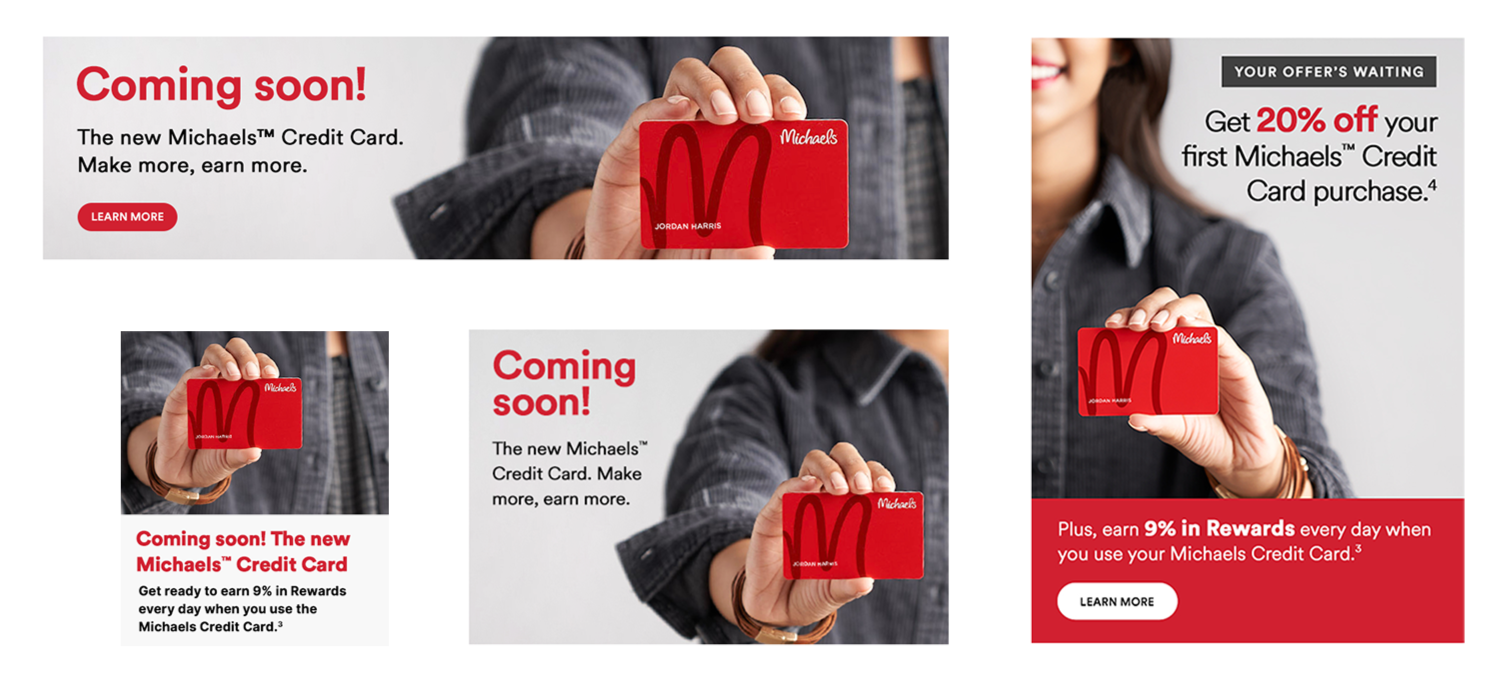
Photography
I art directed the photoshoot that would feature the credit card and be used in cross channel marketing. I wanted the model to be in neutral colors that matched the campaign’s overall aesthetic, so the Michaels red on the credit card would pop. The model was styled with hand-made jewelry, a subtle indicator that she’s a Michaels crafter. The resulting imagery worked seamlessly across both digital and print applications.
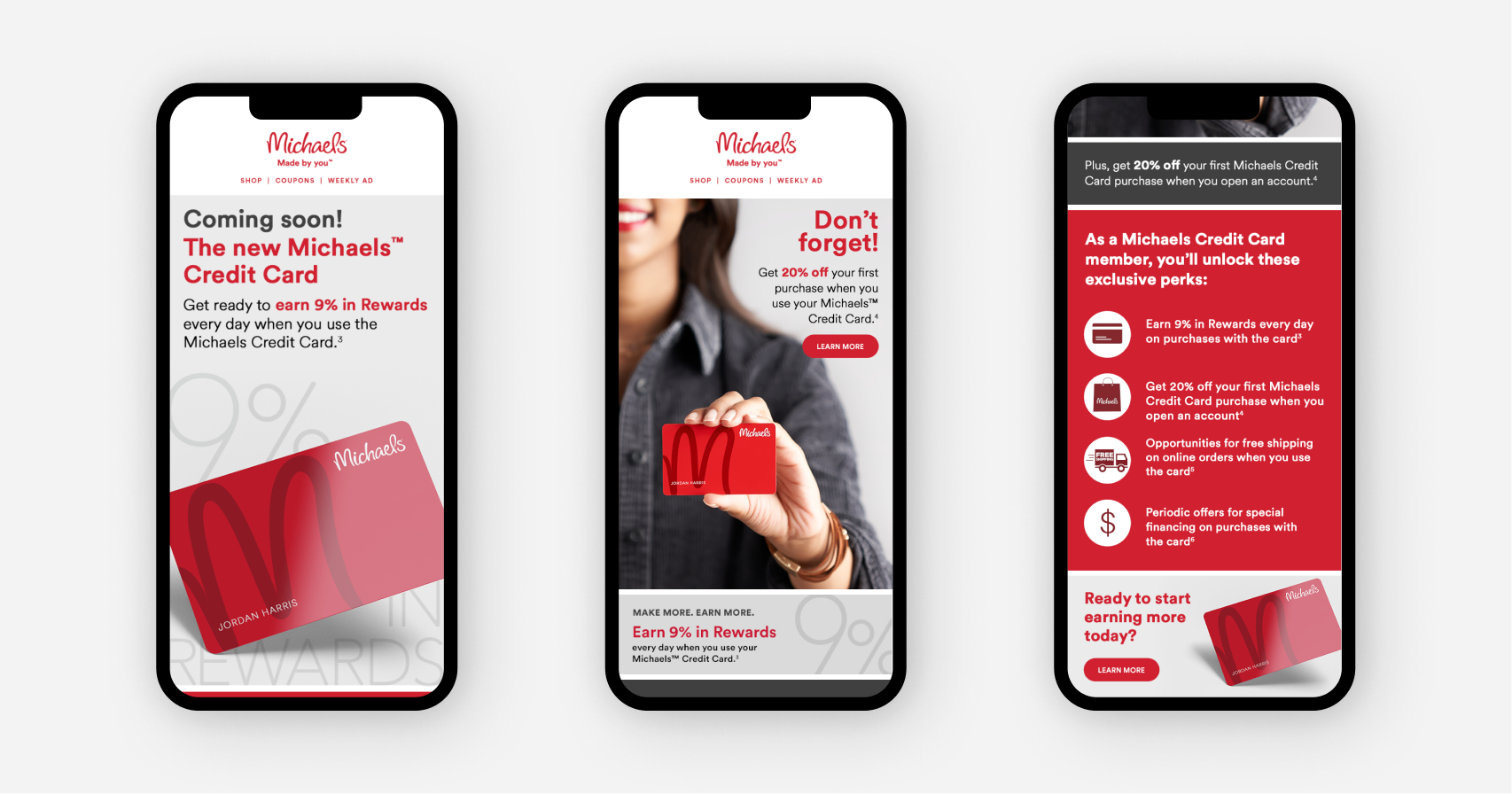
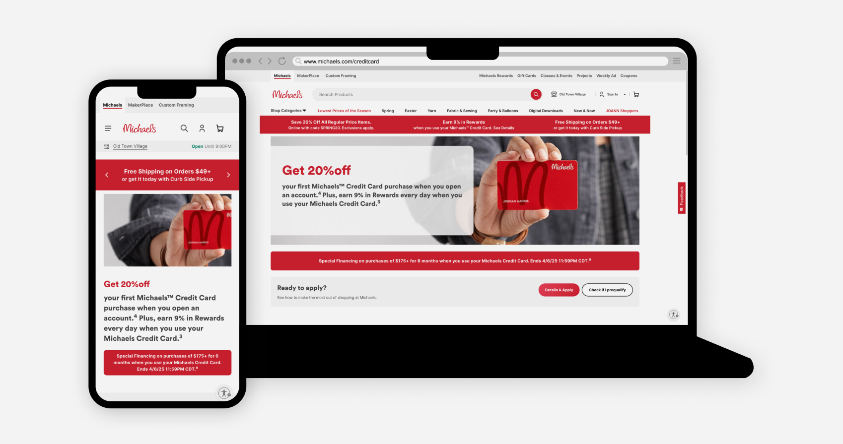
Digital & Print
This campaign spanned both digital and print, and I led design across all major touchpoints. Above, you’ll see the email and website landing page, where the “M” system was adapted for performance-driven layouts, acquisition messaging, and responsive UI design.
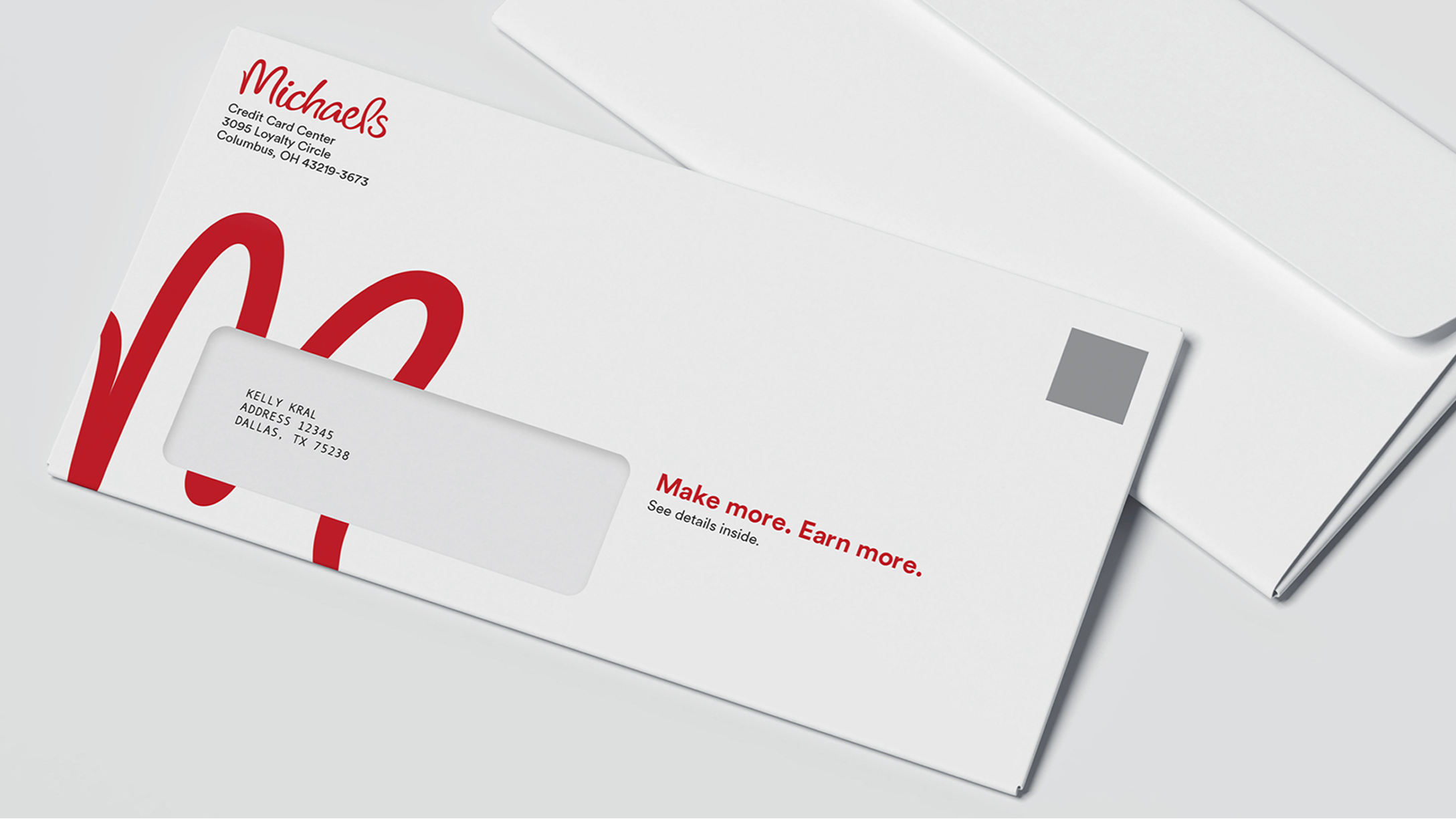
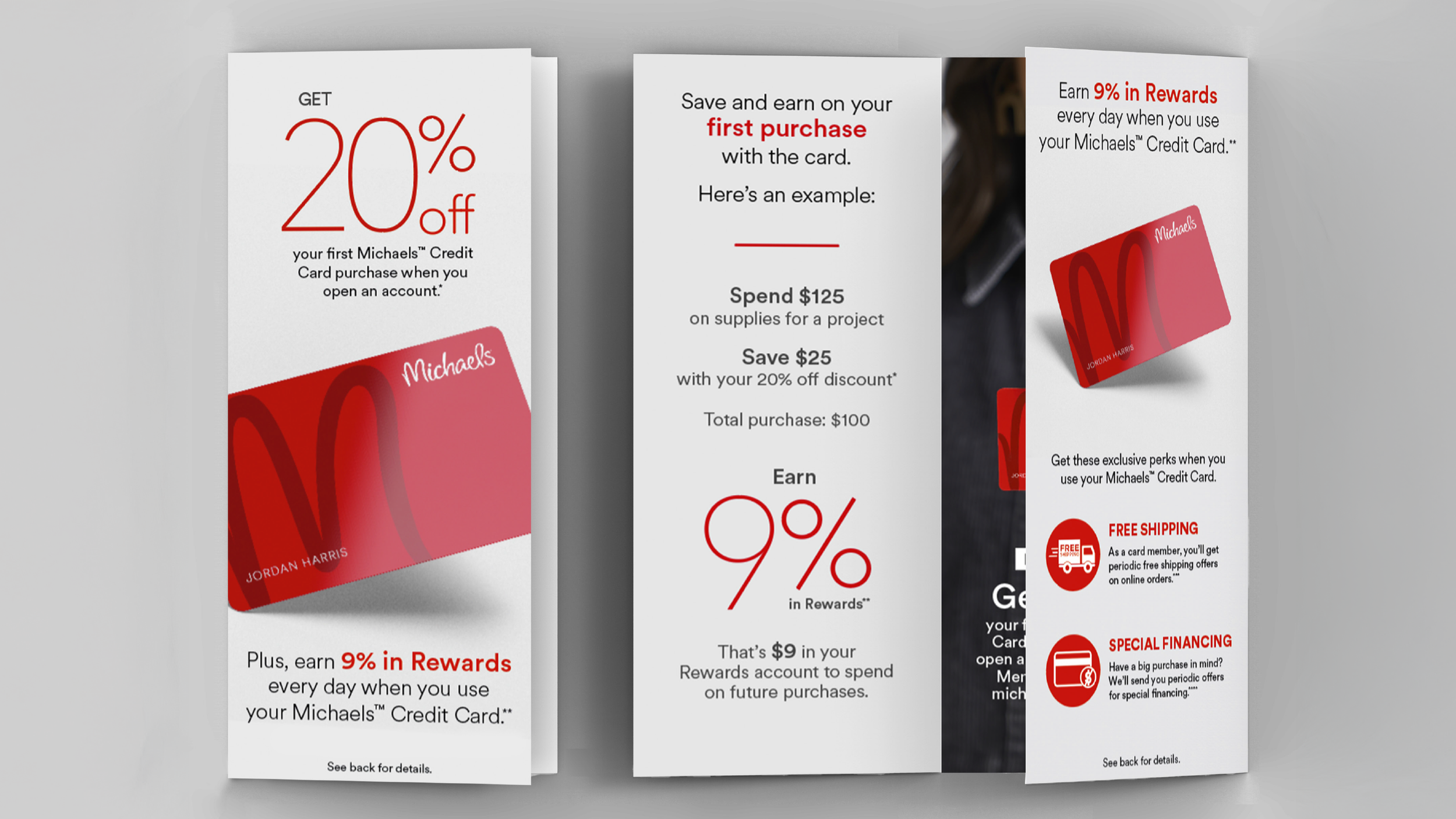
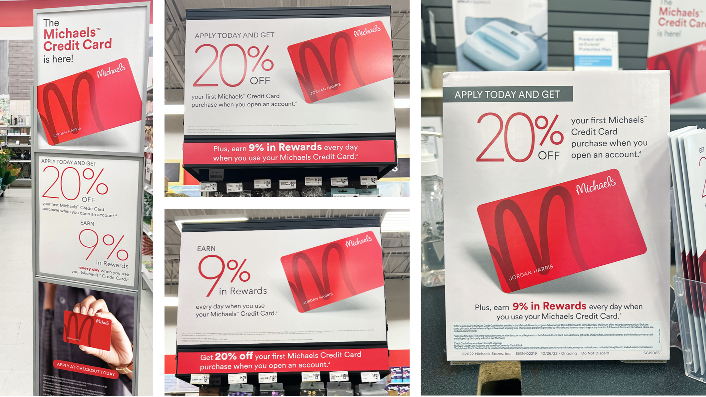
Below are the print components of the campaign, including envelope packaging, card carrier inserts, in-store brochures, and signage. Each piece was designed to feel cohesive with the digital experience while maintaining the clarity and hierarchy required for physical spaces.