Agency Creative Branding

Built around the idea of “Unstoppable. By Design.”, I created a visual system that combines bold typography, vibrant color, and purposeful graphic elements to create a brand that's as intentional as it is impactful. Click through the slideshow below to see the full brand book.
My Role
As Senior Art Director at Agency Creative, I created and brought the agency's rebranded visual identity to life across print and digital touch points.
Brand Guidelines & Visual Systems
Full Website Design & User Experience
Art Direction & Visual Design
Digital & Social Design
Print & Marketing Collateral
The Approach
The goal was to create a visual language that felt confident, energetic, and unmistakably Agency Creative. Bold typography, geometric forms, and a flexible color system work together to balance personality with structure, allowing the brand to adapt across platforms without losing its identity.
The Result
A cohesive, scalable brand system that brings consistency to every touchpoint, from social content and print materials to a fully responsive website.
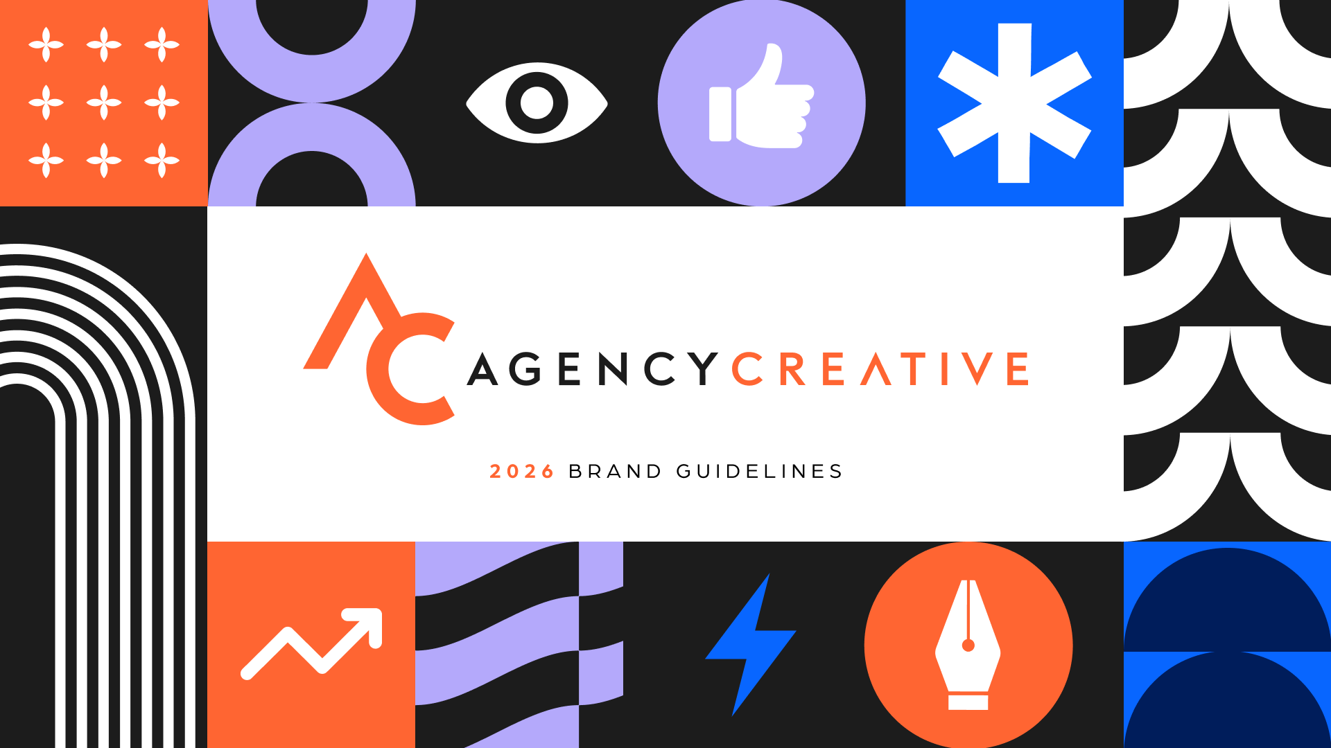
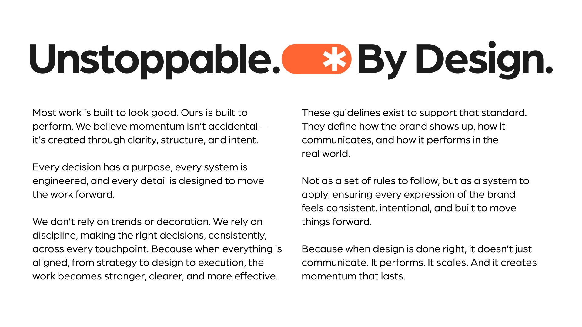
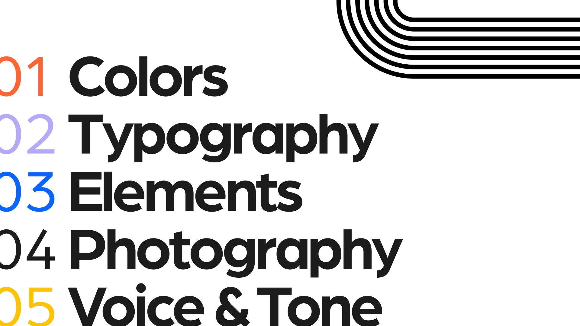

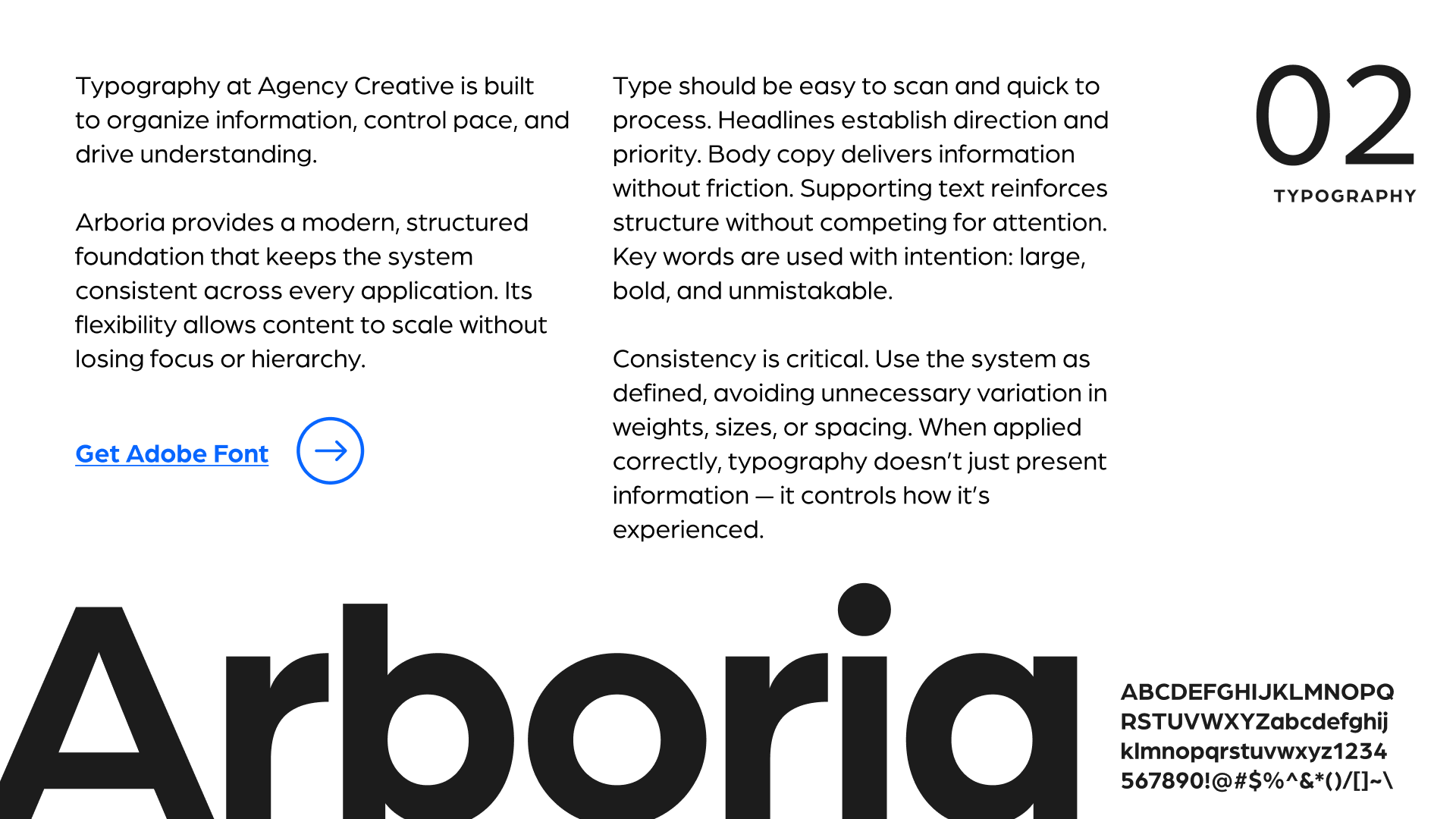
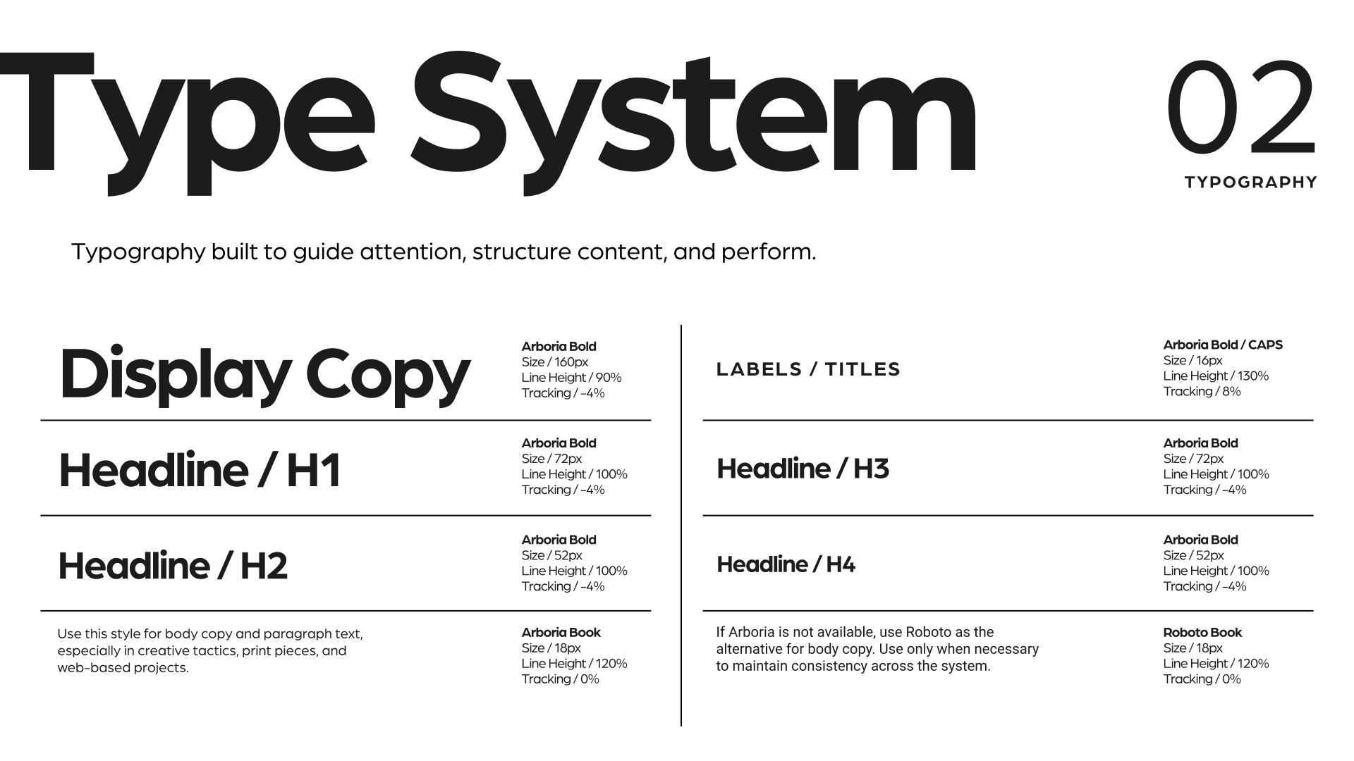
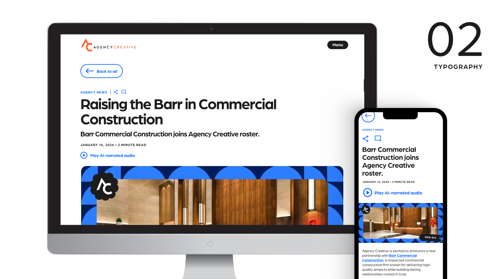


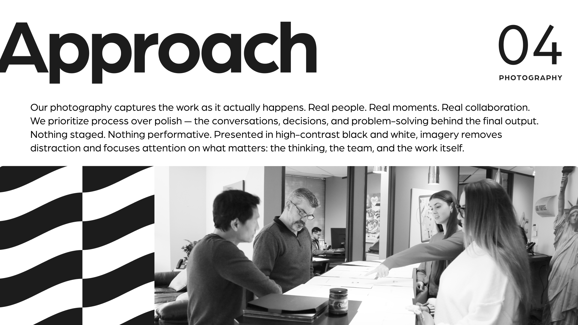
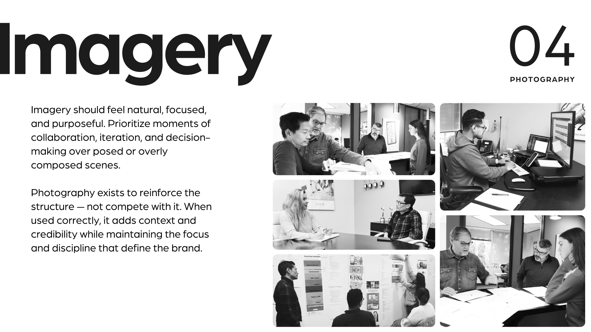
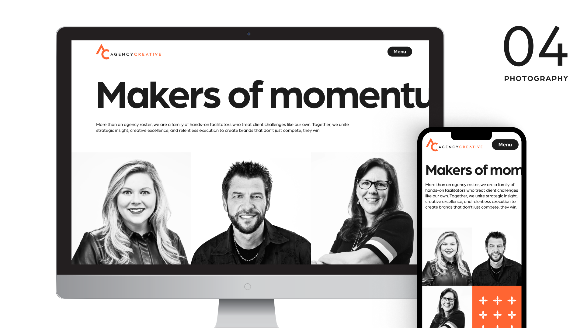

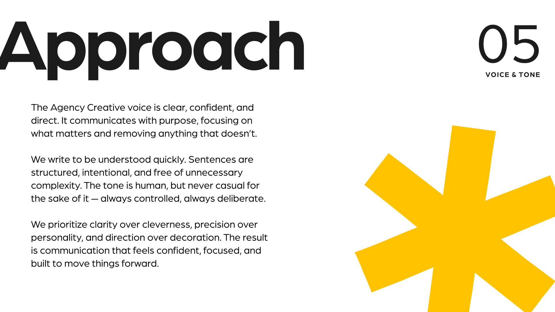
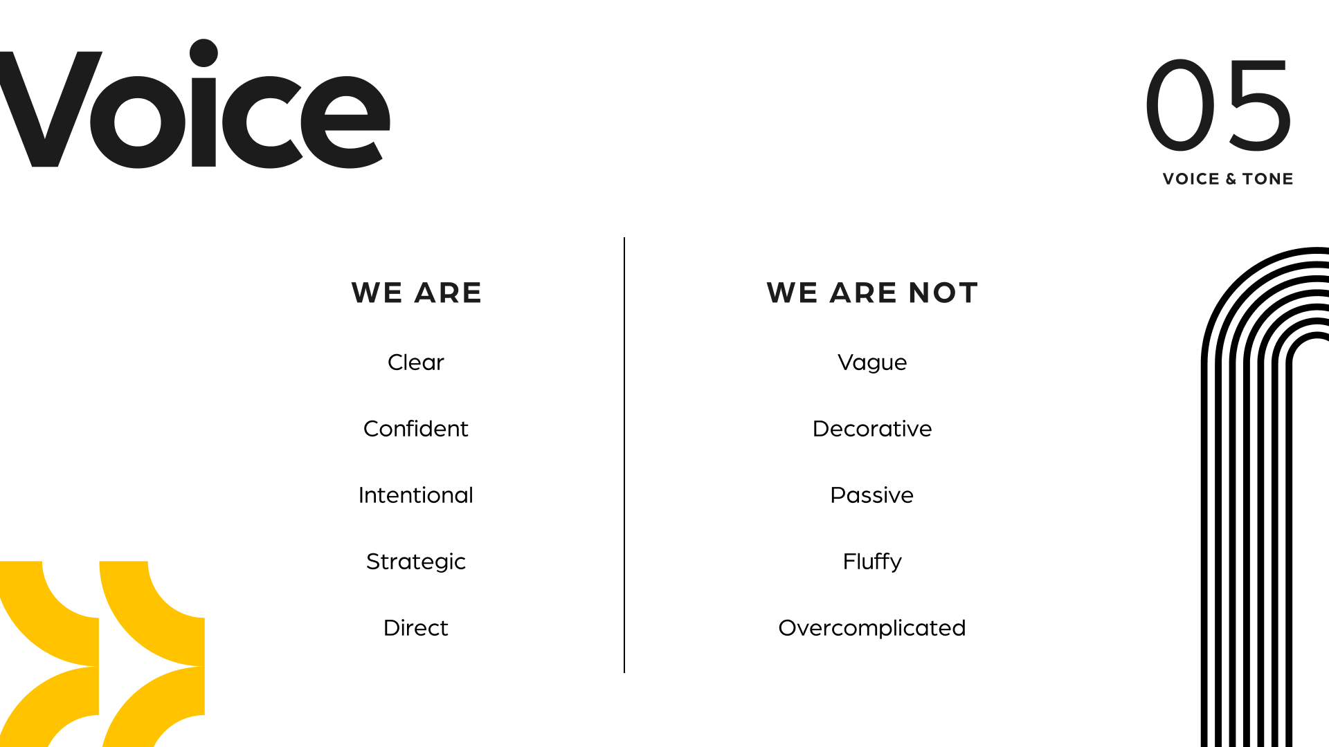
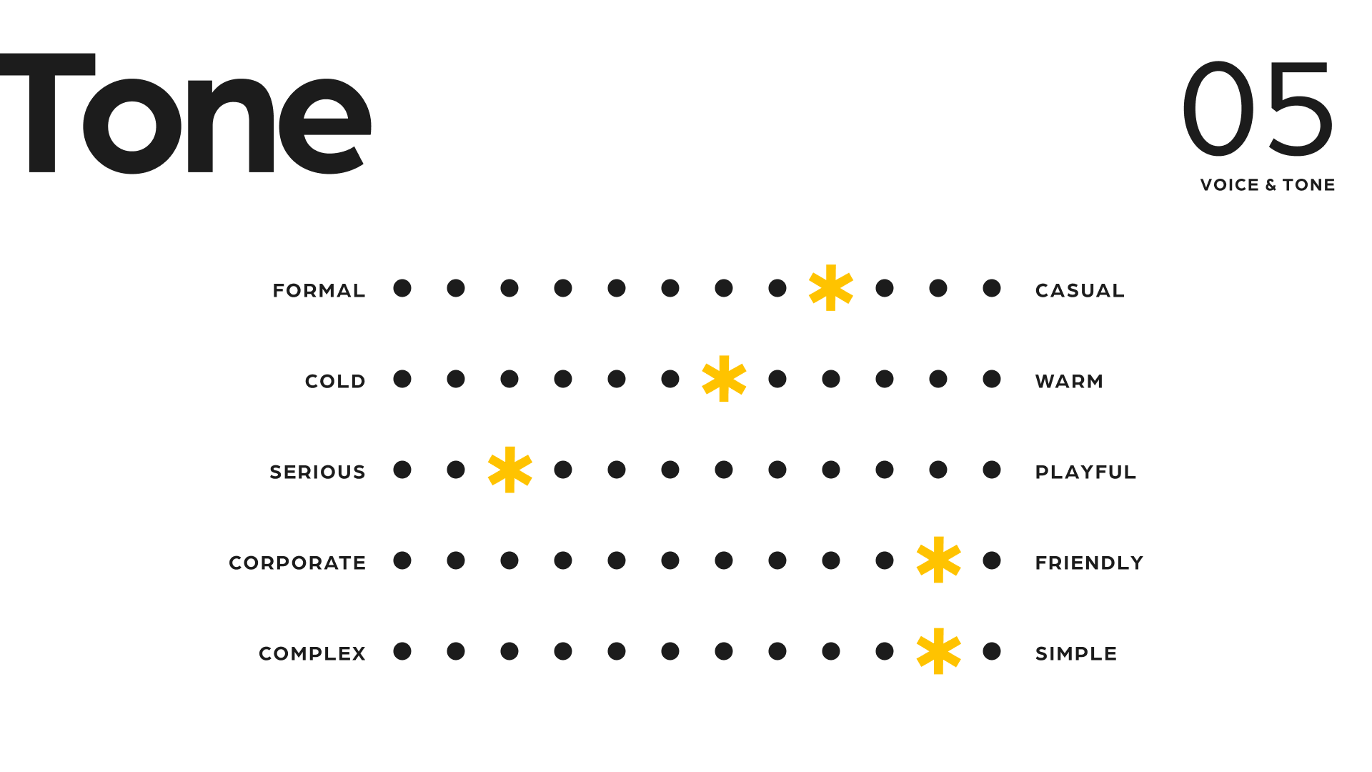
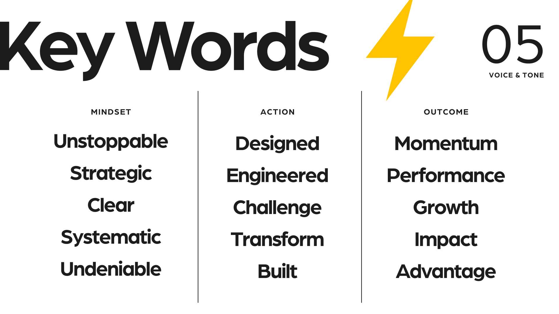
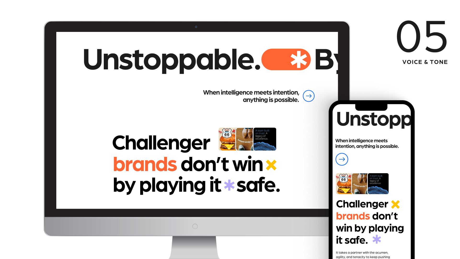
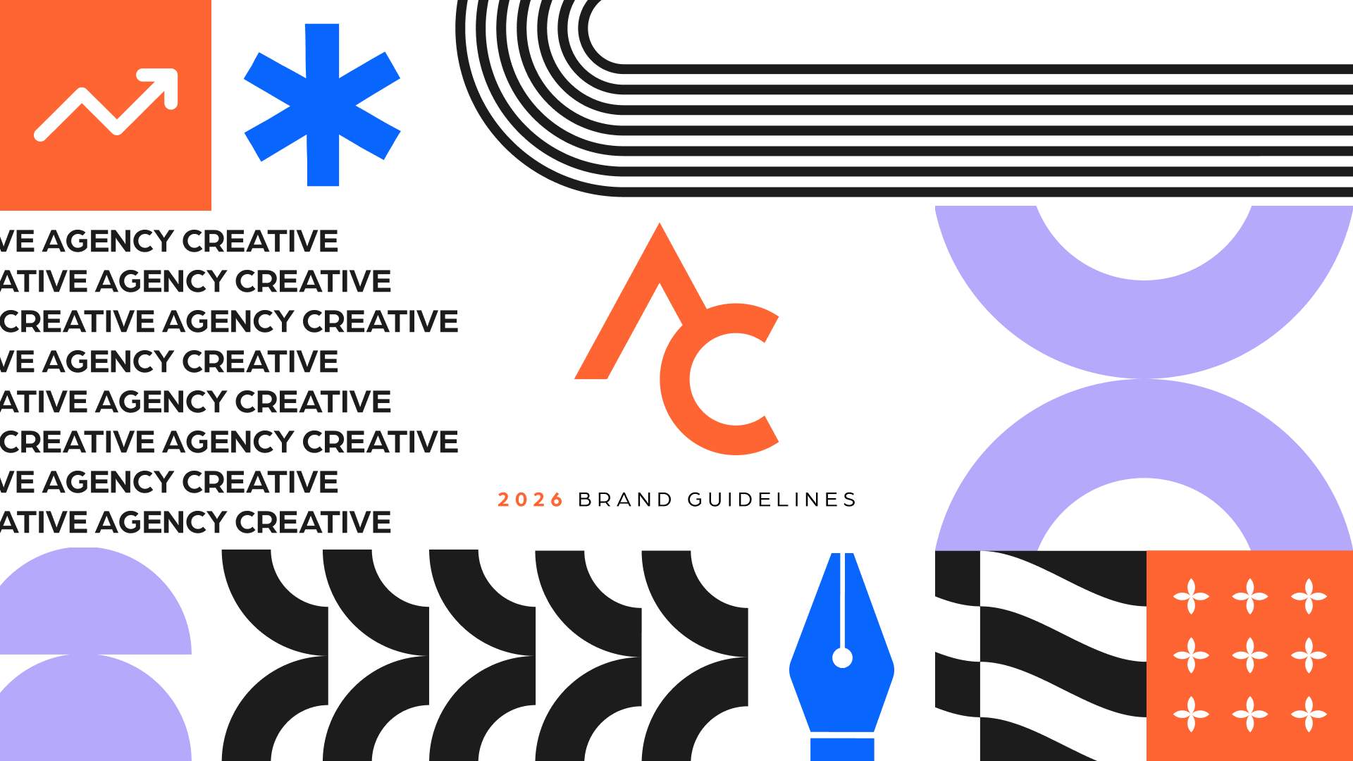
Brand Guidelines
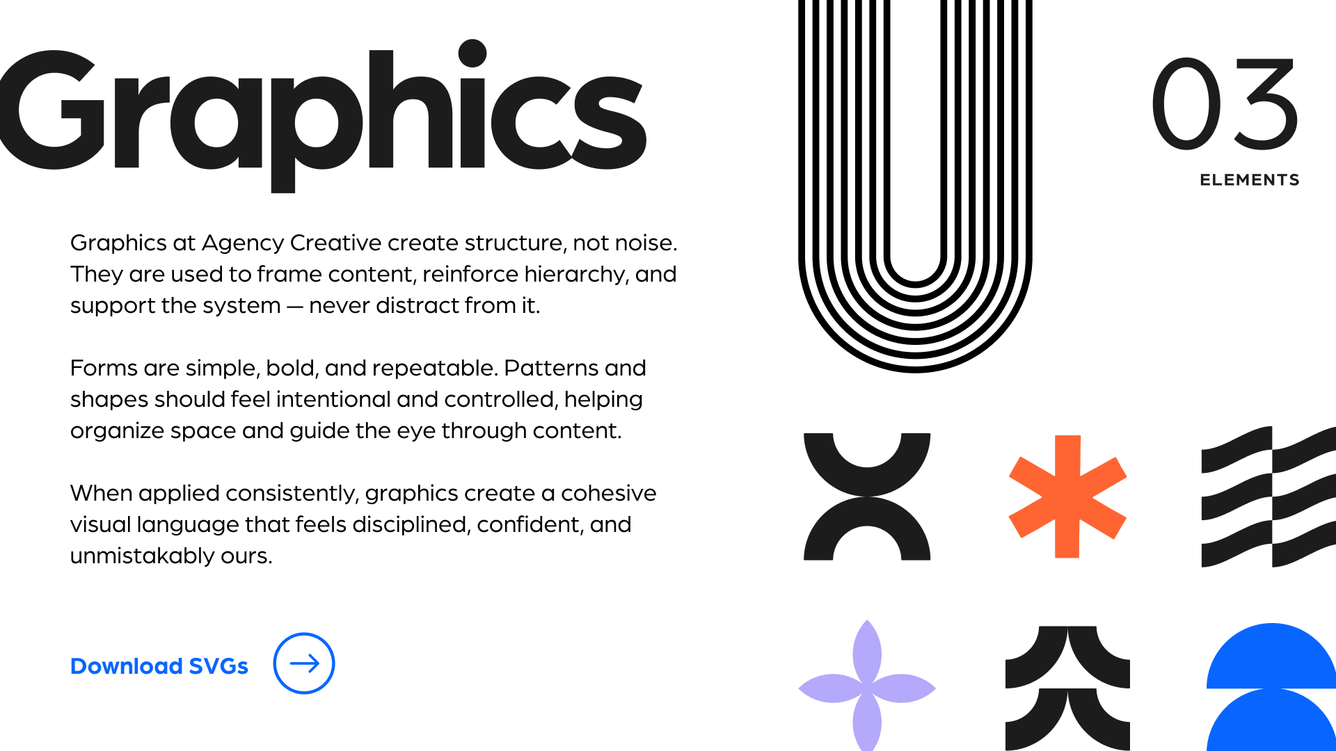
A comprehensive set of guidelines establishes the foundation for a consistent visual identity. From typography and color to graphic elements, photography, and tone of voice, each component was defined to create a recognizable brand across every medium. Above is the full book, and below are some highlighted sections with more detail.
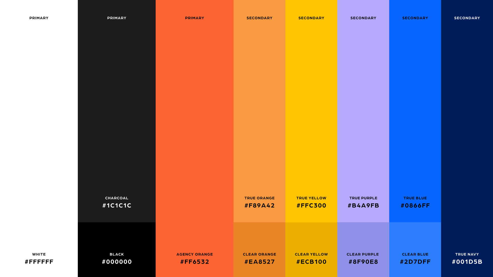
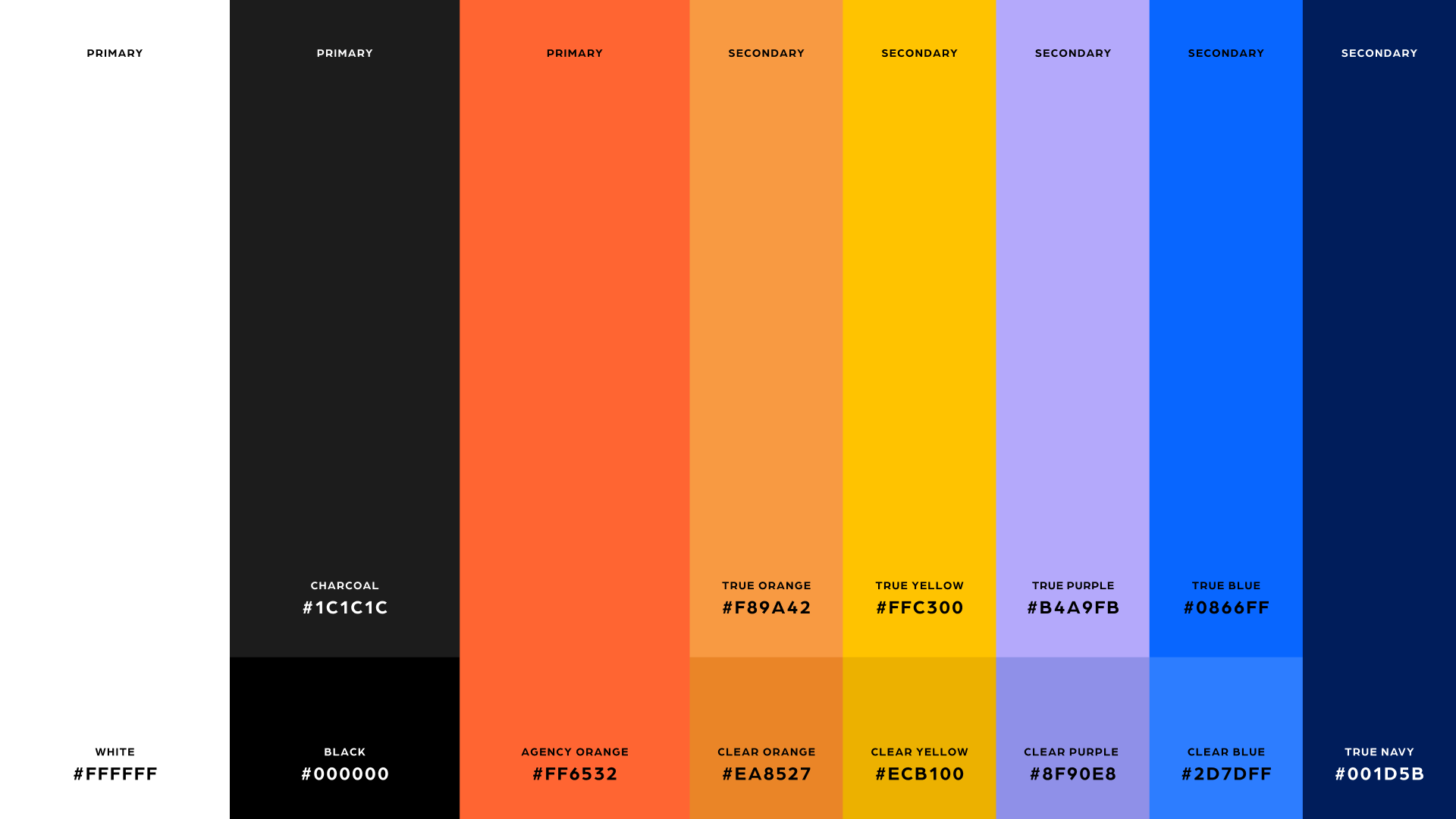
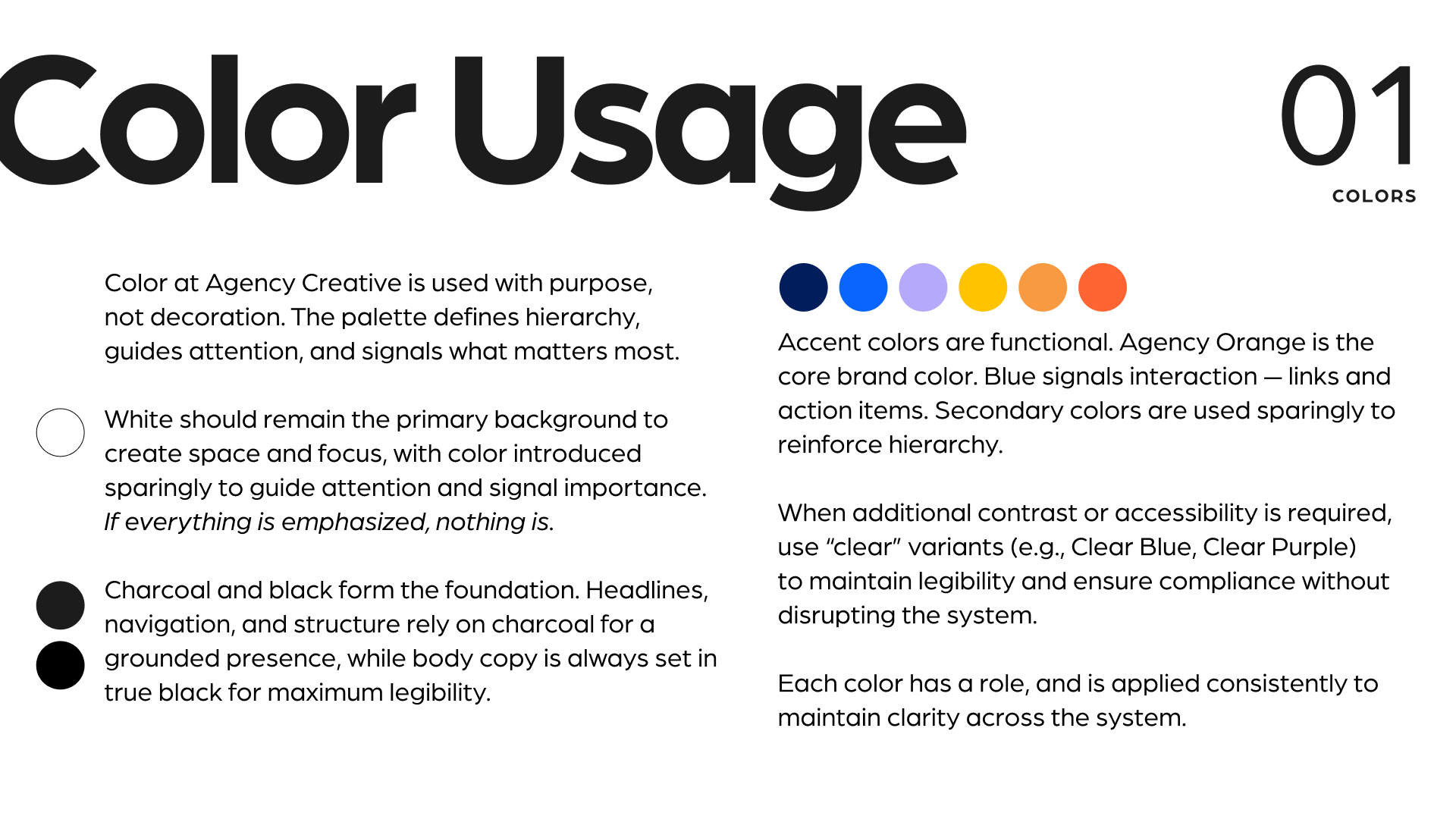
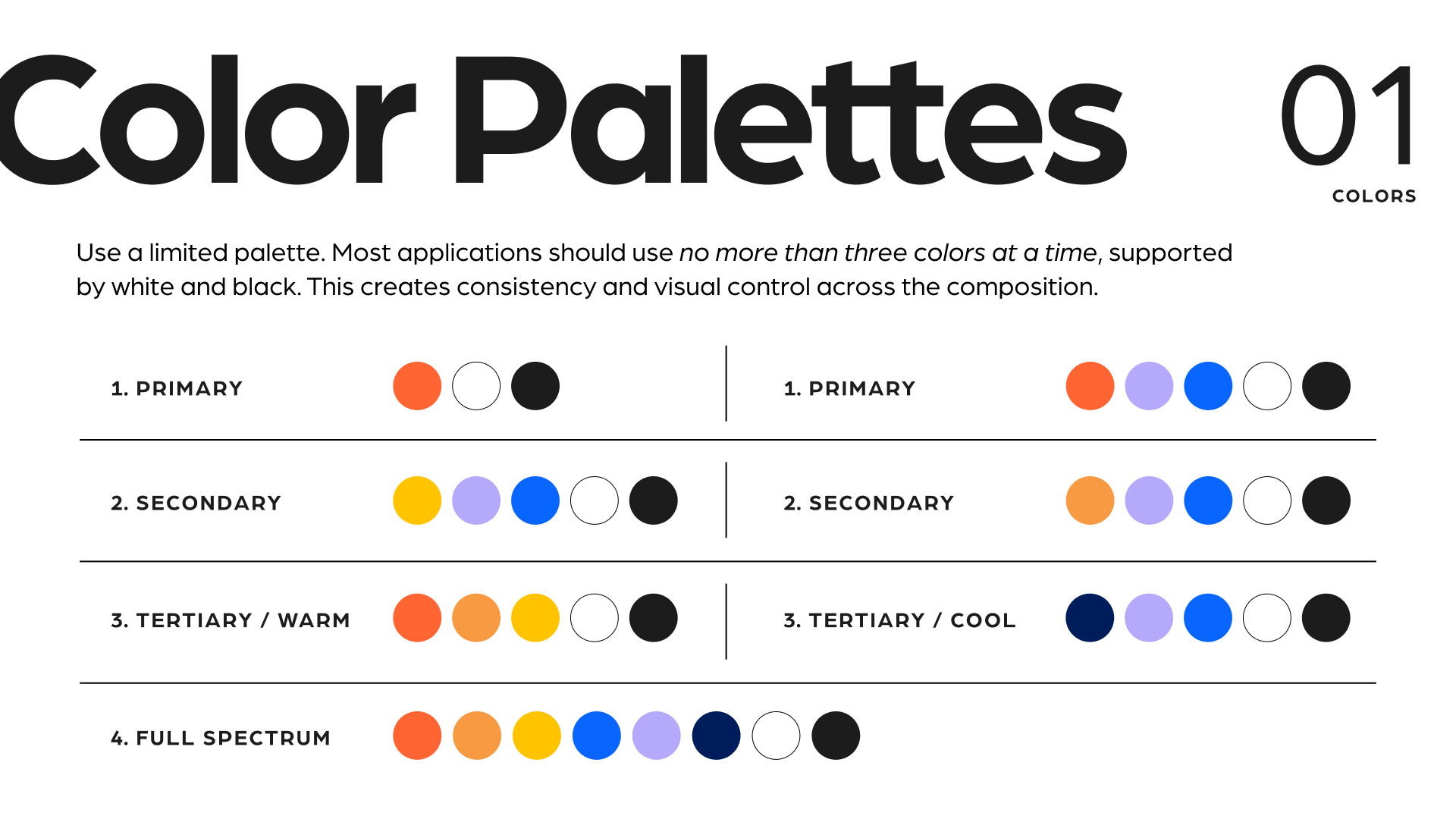
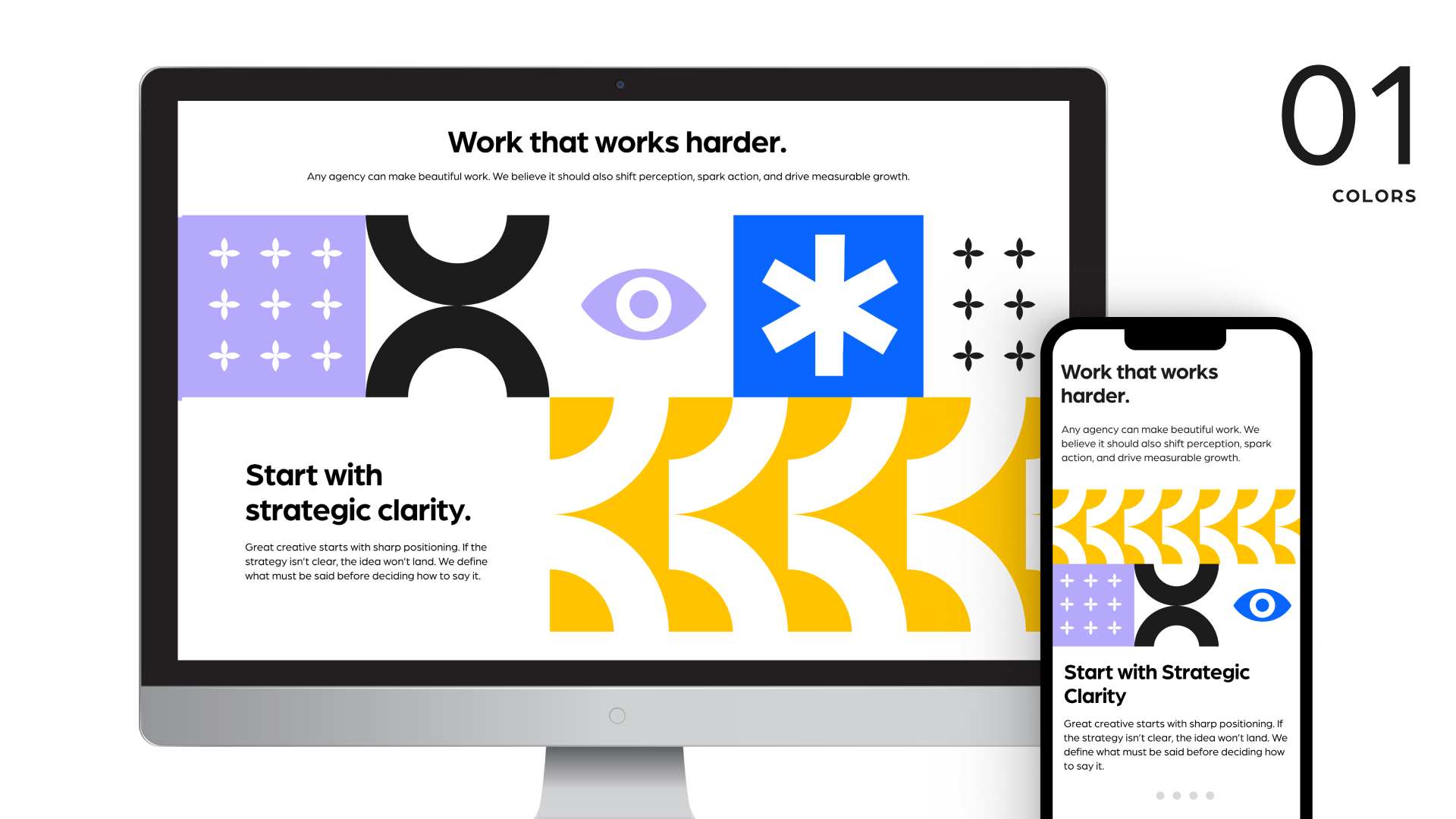
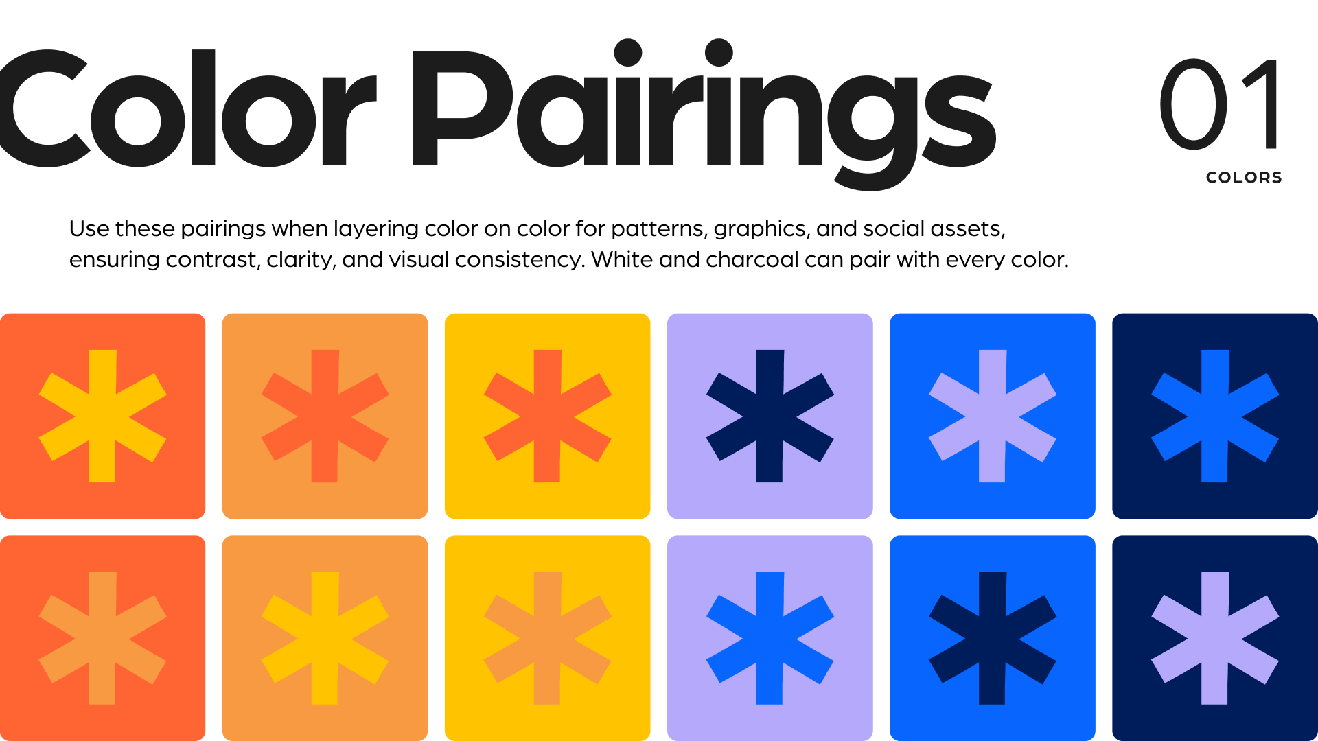
The Color Palette
Anchored by Agency Orange, charcoal, and white, the palette introduces a vibrant spectrum of complementary colors. Each shade serves a purpose, creating contrast, establishing hierarchy, and bringing energy to the brand without sacrificing clarity. Darker and lighter variants of the colors were added to keep everything ADA compliant.
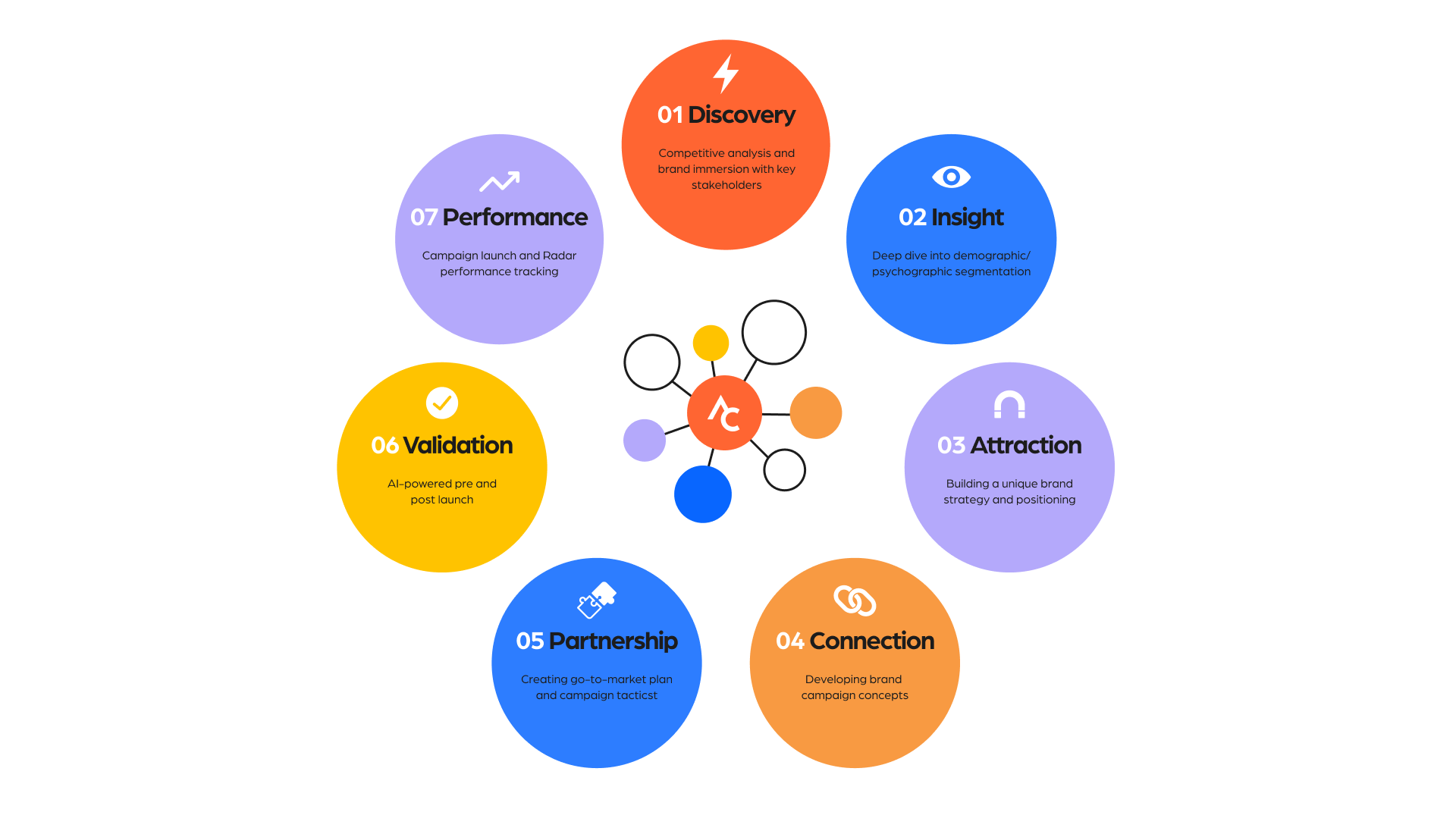
The Visual Identity
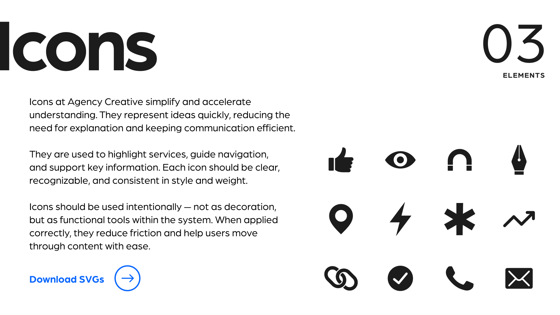
A collection of simple, recognizable icons brings clarity to complex ideas. Designed to complement the broader visual system, these elements help communicate services, illustrate processes, and create consistency across digital and print applications.
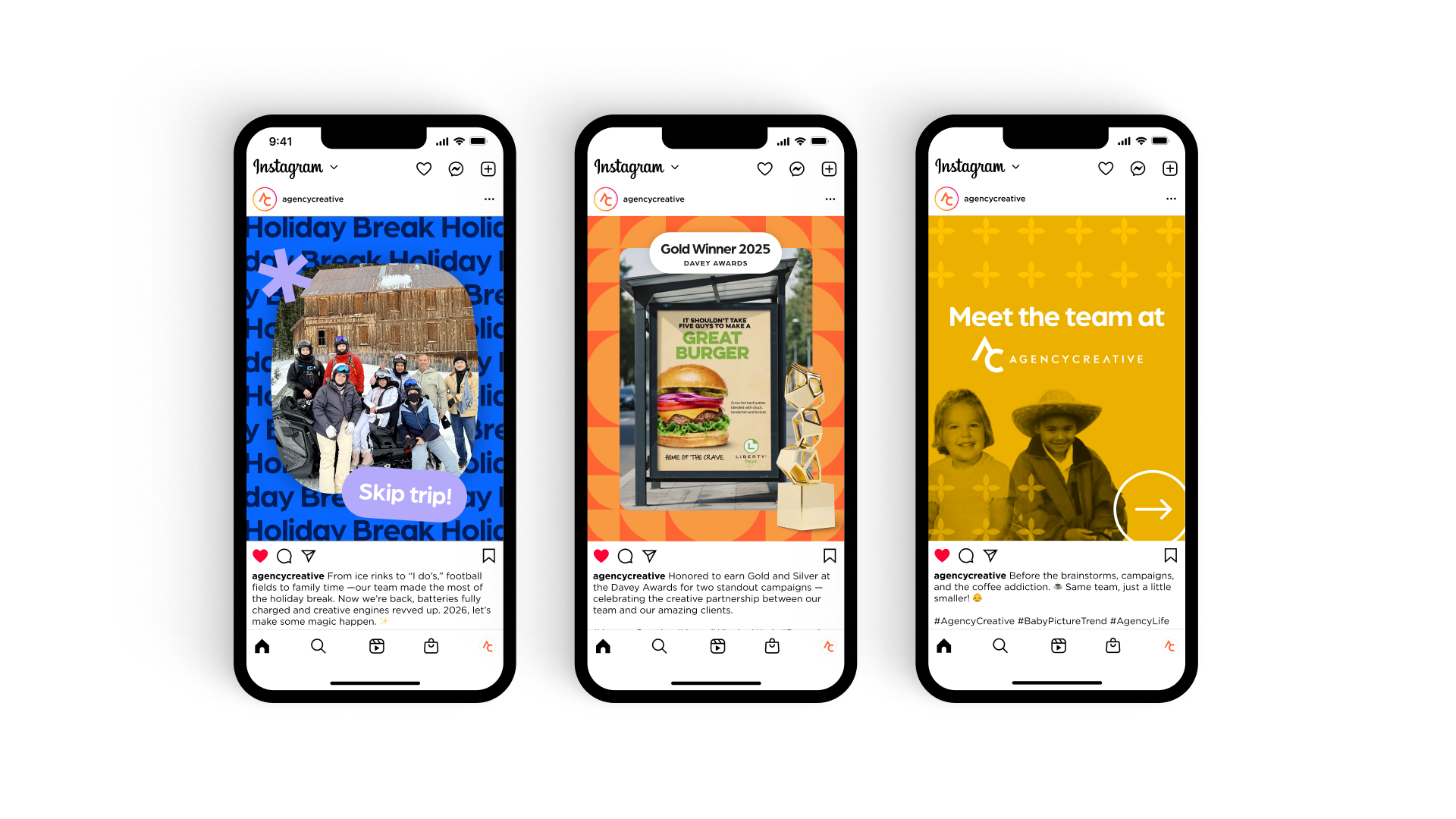
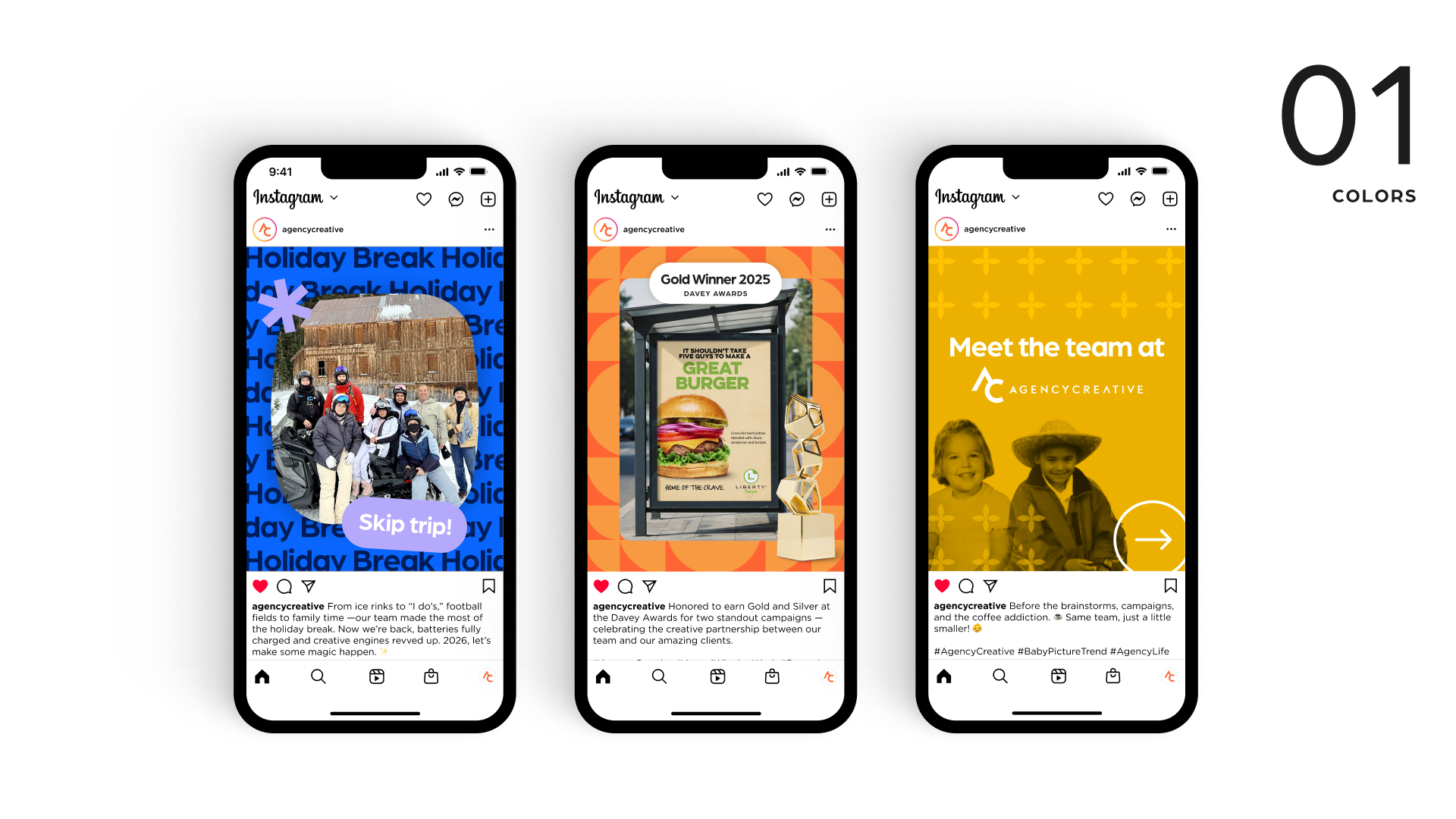
Applied to Digital
The brand comes to life through colorful, engaging social content. Expressive typography, playful graphic elements, and bold color combinations create a flexible visual approach that feels fresh while remaining unmistakably on-brand.
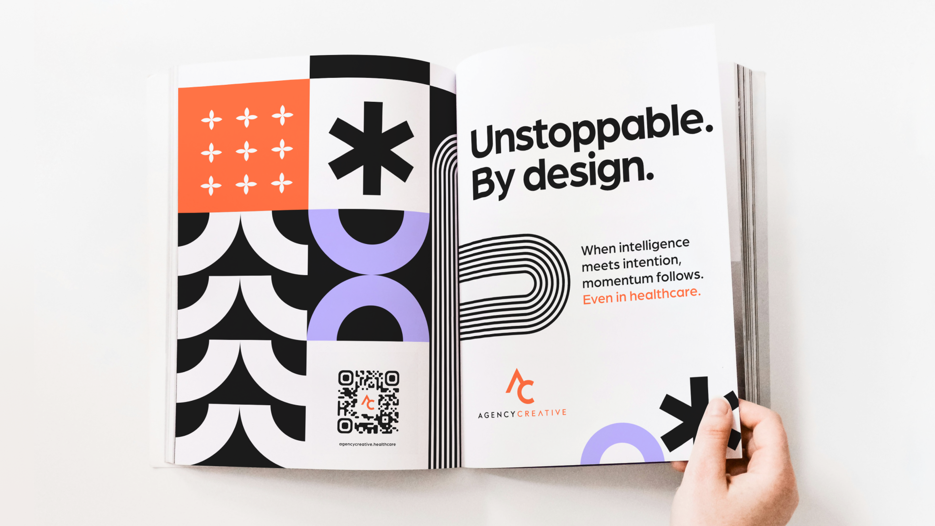
Applied to Print
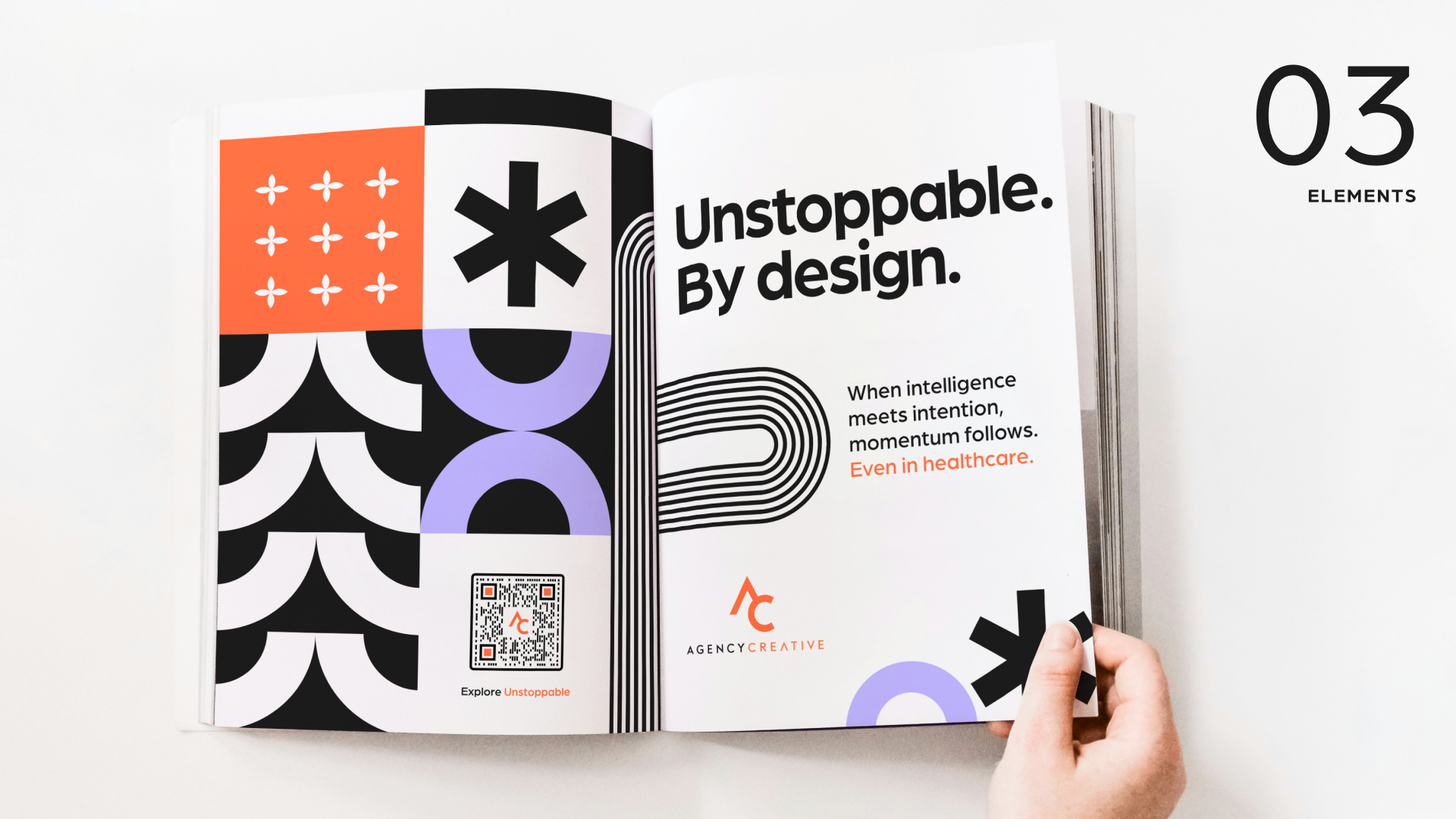
Bold typography and geometric patterns bring the identity into the physical world. The visual system translates seamlessly into print, creating striking compositions that balance visual impact with clear, purposeful communication. This ad was featured in a Texas Health magazine.
The Website
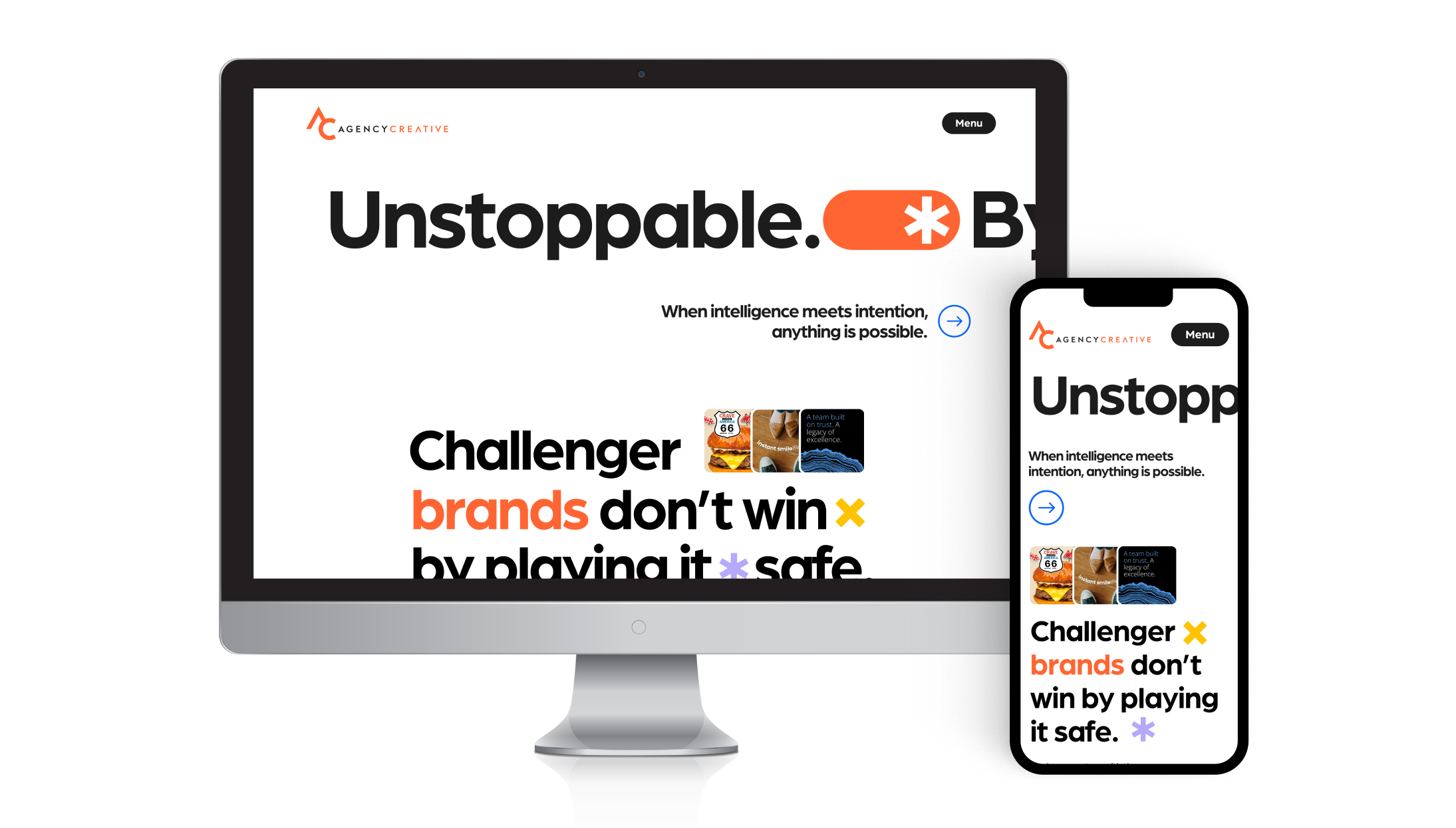
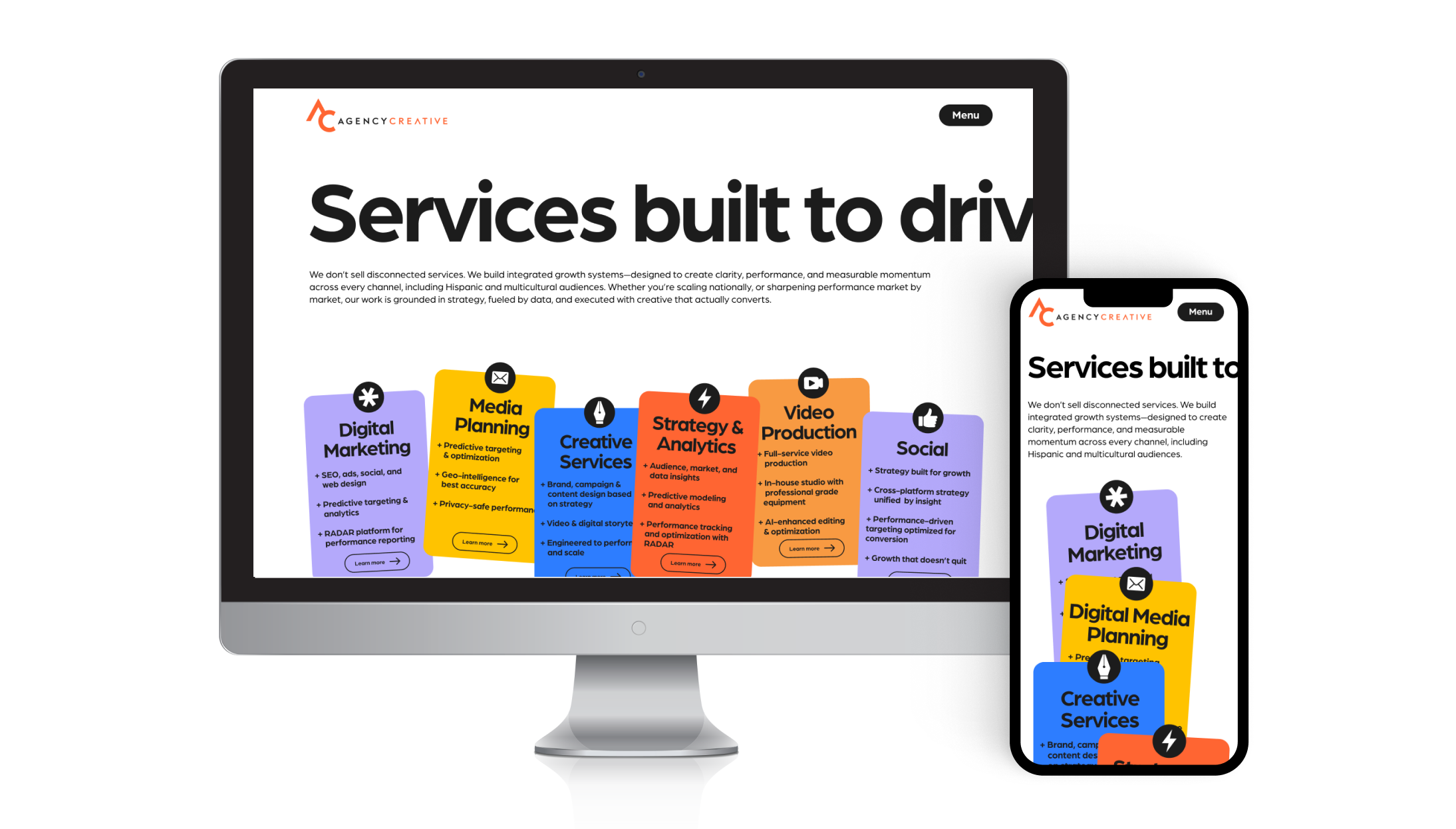
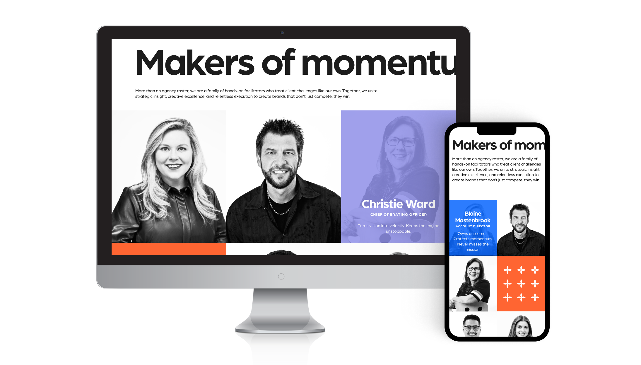
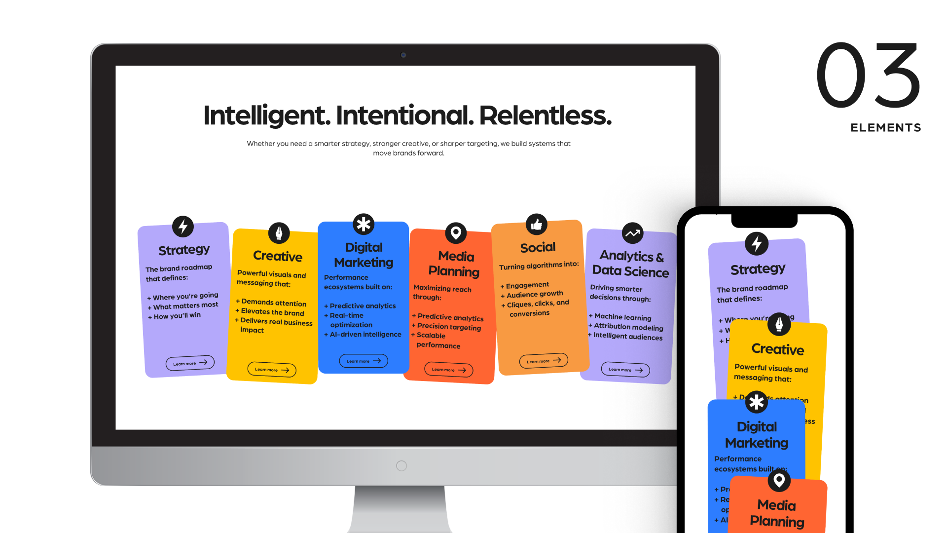
The redesigned Agency Creative website brings the brand's personality into an engaging digital experience. Bold typography, dynamic layouts, and interactive elements establish a visual rhythm, while a flexible, responsive design system creates consistency across more than 30 pages. Below are just a few key pages.