Ibotta Free Thanksgiving
I led the creative refresh for Ibotta’s flagship Free Thanksgiving program — a nationwide initiative that has fed over 11 million families.
The goal was to modernize the look and build a system that scaled across app, social, and partner channels.
My Role
Creative lead for multiple campaign concepts
Oversaw timelines, assignments, and creative
Full visual identity refresh + multiple hero lockups
In-app UX, social, paid media, email, and marketing extensions
Scalable design system applied across 4 campaigns and hundreds of assets
The Approach
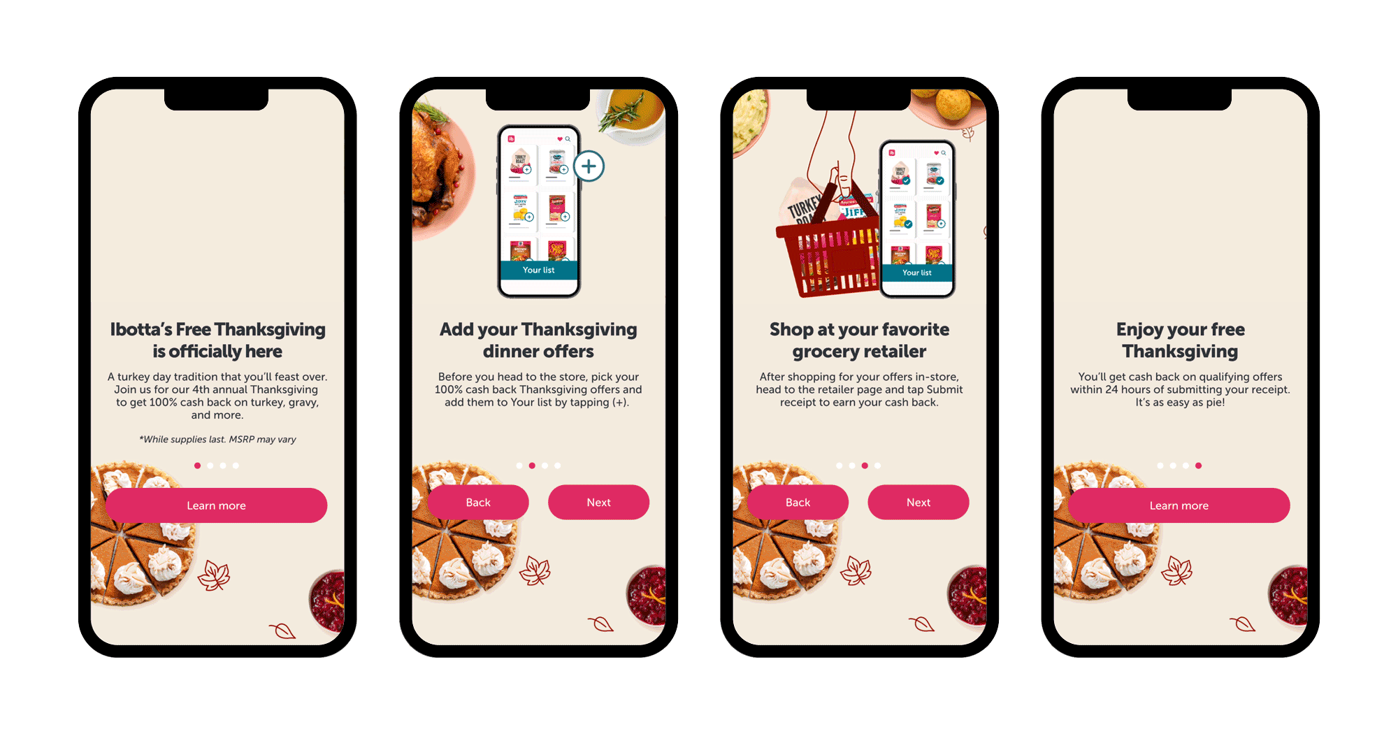
The program had multiple user flows, with separate steps for new and returning users. Step-by-step directions were needed for the many different in-app materials through clear messaging and visuals, all while ensuring the campaign scaled seamlessly.
The Result
The refreshed campaign successfully strengthened brand recognition, elevated the Free Thanksgiving program, and set a new standard for seasonal campaigns.
Team
Jenna Rogalski (Illustrations), Joe Perez (Motion), Chris Webster (Creative Director), Rachel Reynolds (Art Director), Sam Ibarra (Graphic Designer), Alvin Gait (Developer)
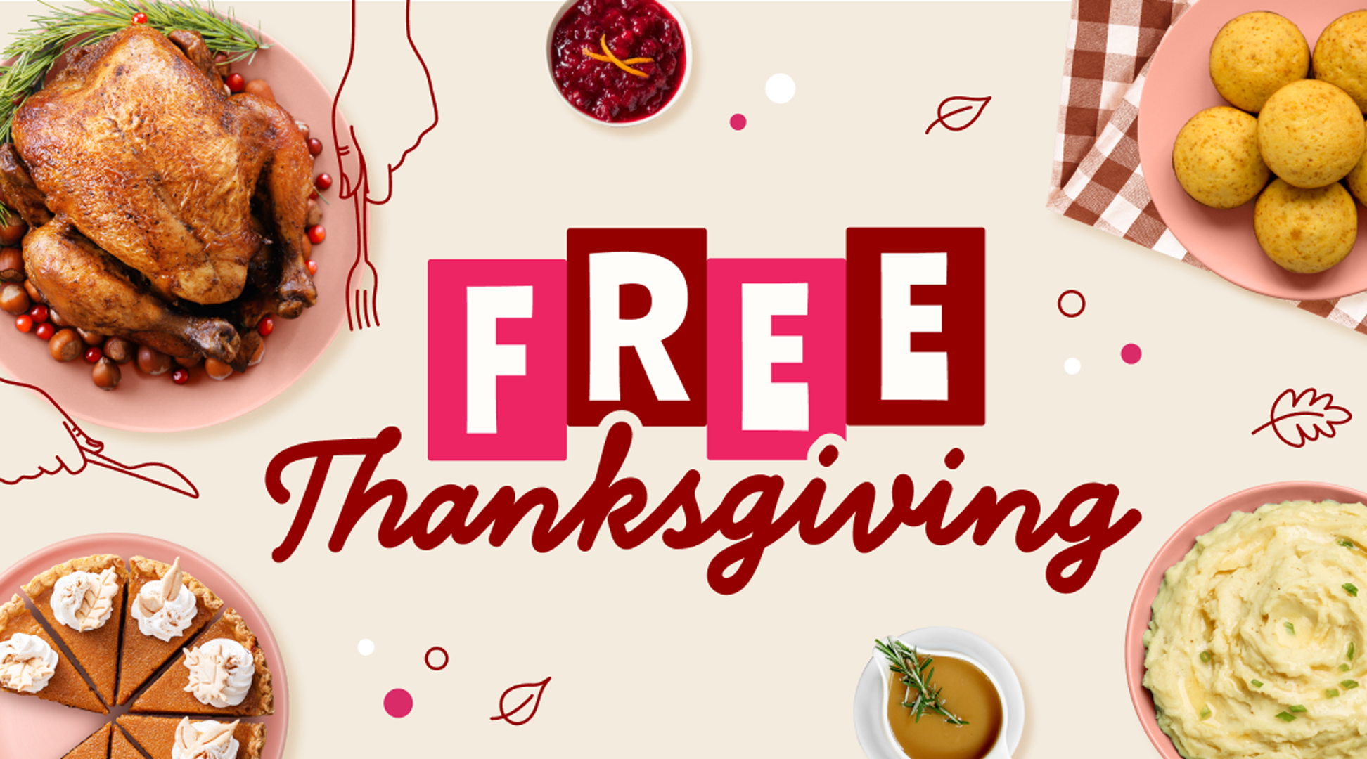
The Concept
The visual identity evolved through extensive exploration and moodboarding, ultimately landing on a Norman Rockwell-esque, diner-inspired aesthetic. We aimed to refresh the look without straying too far from previous years’ lockups, striking a balance between familiarity and renewed excitement. The combination of line drawings and real photography was introduced to add playful movement to the instructional moments, making the steps feel dynamic, clear, and engaging. On top of that, I got to redesign the app icon for the first time in Ibotta’s history.


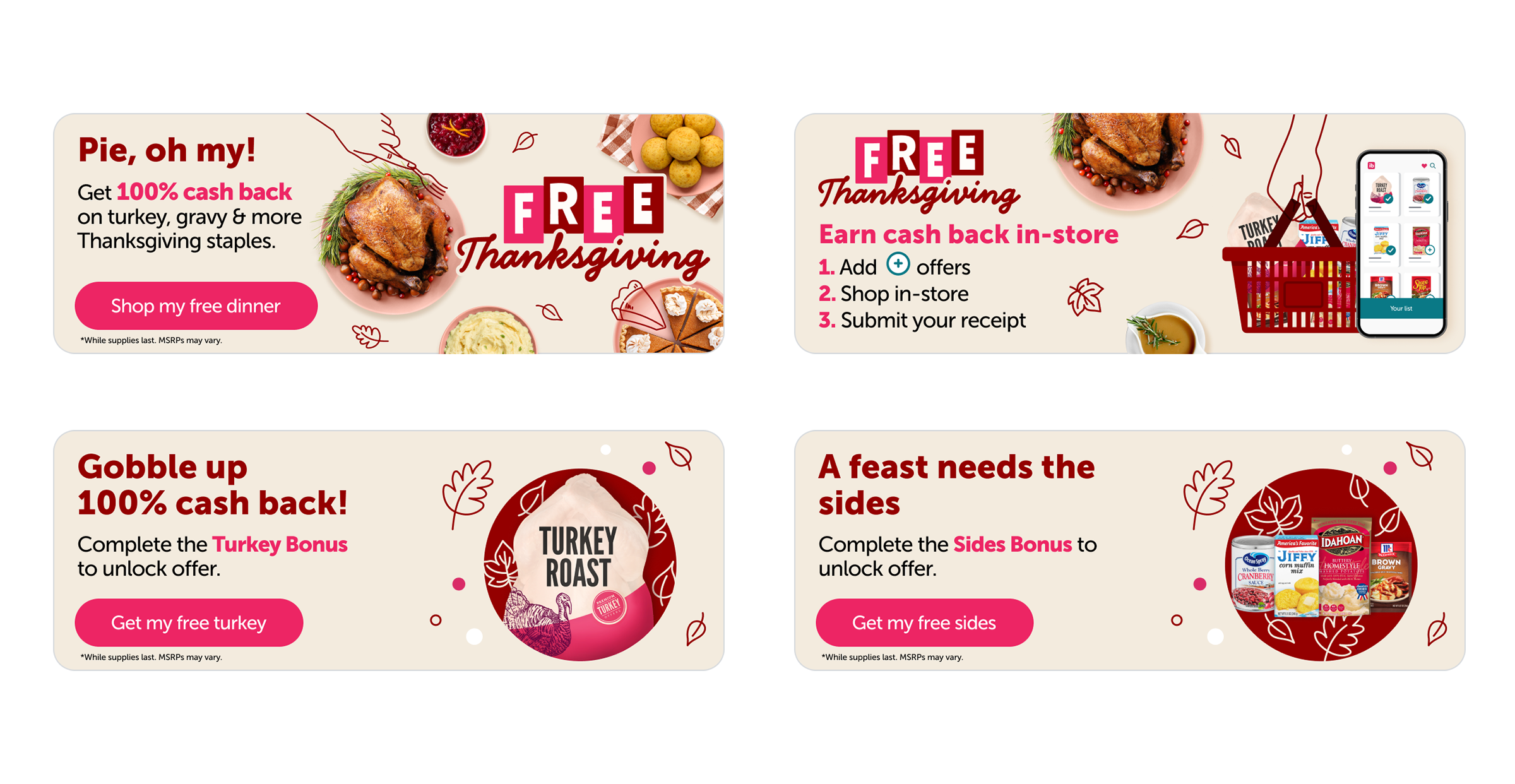
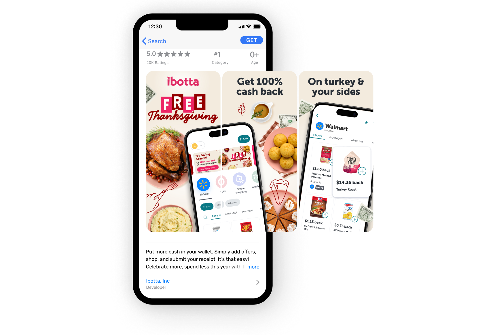
In-App Assets
Featured here is one of the full-screen Home Screen Takeovers designed for the Ibotta app. I collaborated with both development and motion design to ensure the animations, layout, and instructional graphics felt intuitive, cohesive, and tailored to each version of the Thanksgiving program. Also shown are a few examples of the campaign’s in-app banners and App Store screens, which worked together to drive participation and maintain a consistent visual experience across the platform.
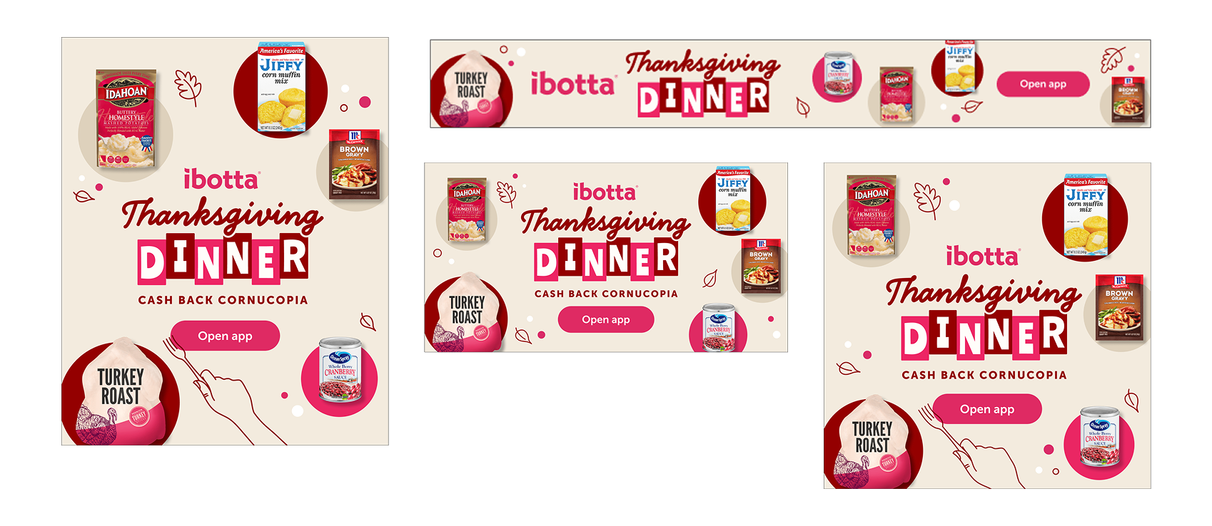
Marketing Materials
Across paid media, email, and social channels, I extended the campaign’s look and feel into high-impact marketing assets, including digital ad creative, email templates, and social banners. I applied the same retro-inspired visual language and messaging framework used in the in-app assets, delivering a cohesive, cross-channel creative that amplified brand recognition and drove consistent engagement. The result: a unified campaign experience that resonated whether users opened the app, checked their inbox, or saw an ad.