Certainti
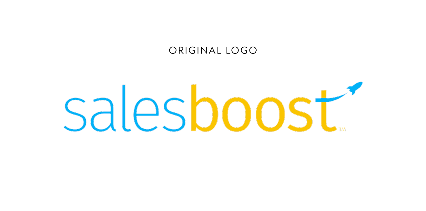
I developed a new brand identity for Certainti that repositioned the former SalesBoost platform into a confident, human-centered AI performance brand built for scale beyond hospitality.
My Role
Led the brand identity from concept through rollout across digital, physical, and campaign touchpoints.
Developed logo concepts through final mark selection
Created the visual identity system including color, typography, and brand rules
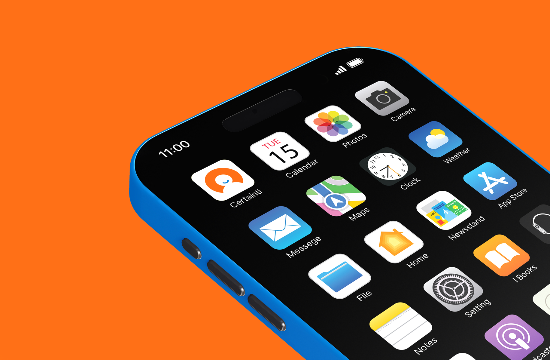
Designed the app icon and digital-first brand presence
Established brand guidelines for scalable use across platforms
Directed photography tone and visual style
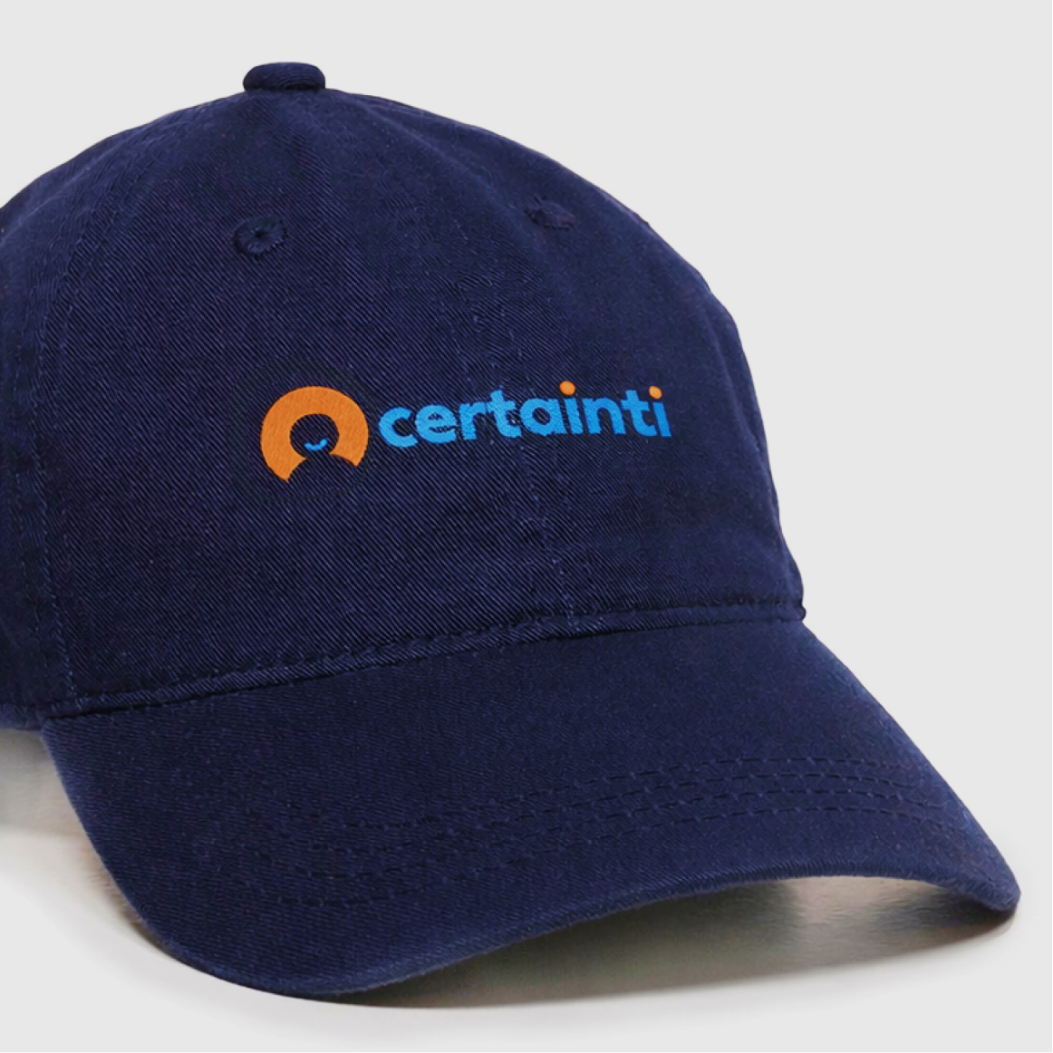
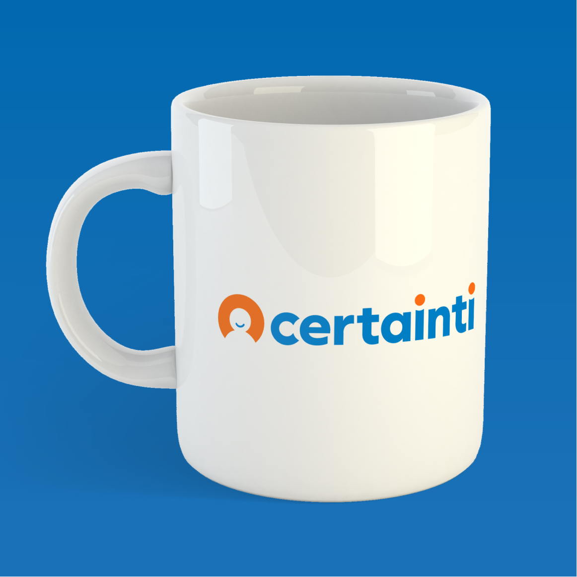
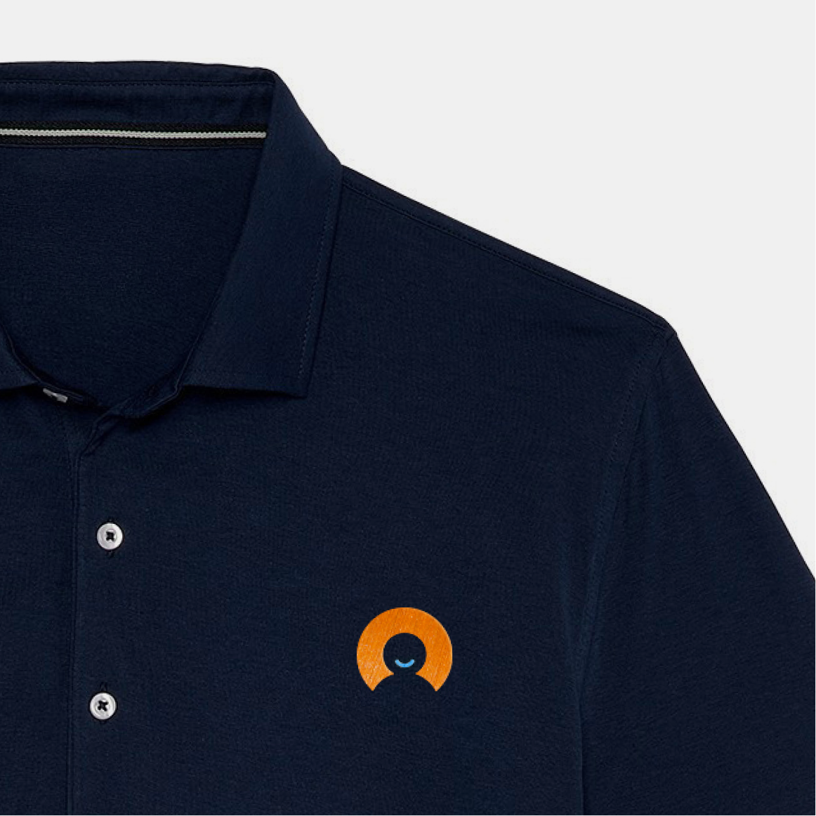
Applied the identity across merchandise, website, and marketing campaign assets
The Approach
Certainti needed to overcome legacy perceptions tied to the SalesBoost name and signal a shift from “sales training” to a modern, AI-powered performance platform focused on human interaction.
The identity balances intelligence with warmth. A confident circular mark suggests conversation, connection, and certainty, supported by a bright blue and orange palette and a clean typographic system designed for clarity across digital platforms. The system was built to feel human, modern, and highly scalable across industries.
The Result
Certainti now presents as a credible, future-ready technology brand that feels both intelligent and approachable. The identity translates seamlessly from app icon to website to campaign materials, clearly signaling the company’s evolution and supporting its expansion beyond hospitality.
The Visual Identity
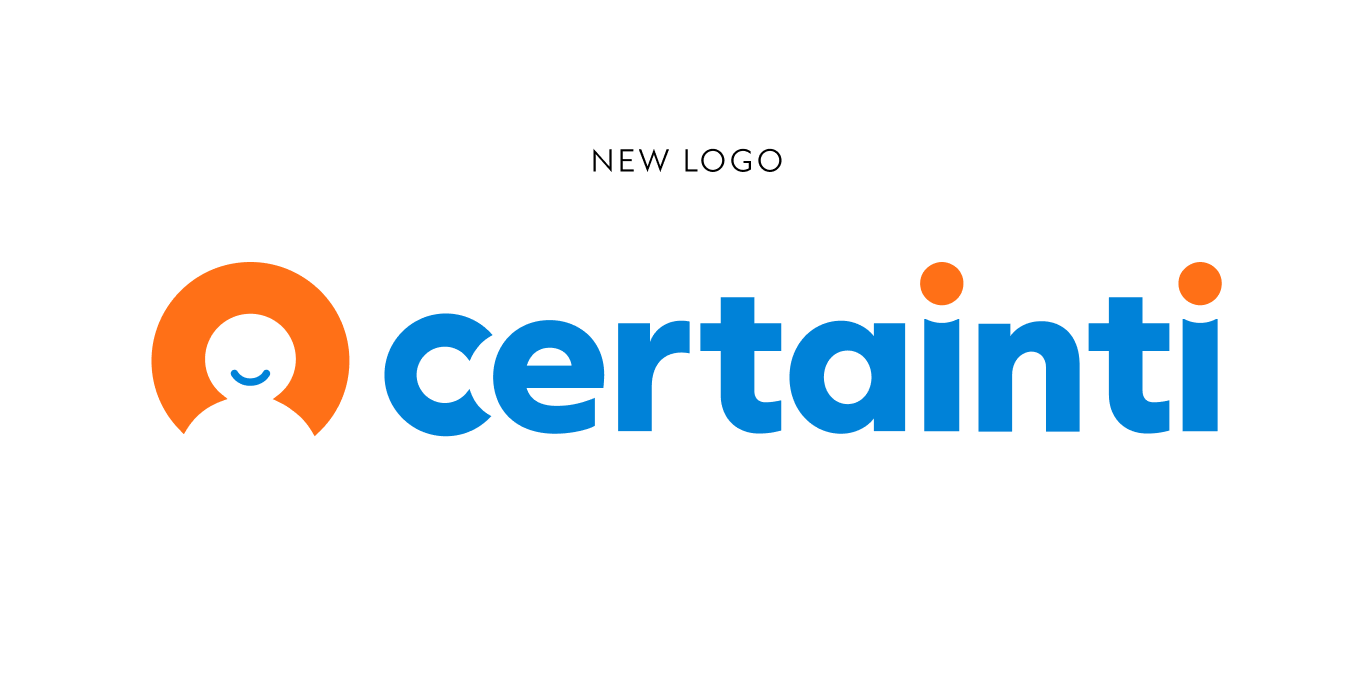
The final concept centers on the letter C from Certainti.
Rotated on its side, the C becomes the foundation for the human icon seen in the logo mark, forming a subtle smile and suggesting conversation and approachability.
That same shape then informs the wordmark, creating a visual relationship between the symbol and the typography.
This connection allowed the logo to feel intelligent, human, and highly cohesive while remaining simple enough to scale across digital platforms.
The Applications
The identity was designed to live primarily in digital environments while remaining flexible across physical applications. From app icon and website to merchandise and campaign materials, the brand maintains clarity, warmth, and recognizability. The system supports both everyday platform use and larger marketing moments without losing consistency.