Barr Commercial Construction
I developed a comprehensive brand identity system for Barr Commercial Construction that positions the company as a trusted, right-sized partner with the expertise of a large firm and the integrity of a small one.
My Role
Led the brand identity from initial concept through final rollout across physical and digital touchpoints.
Developed and refined multiple logo concepts through final mark selection
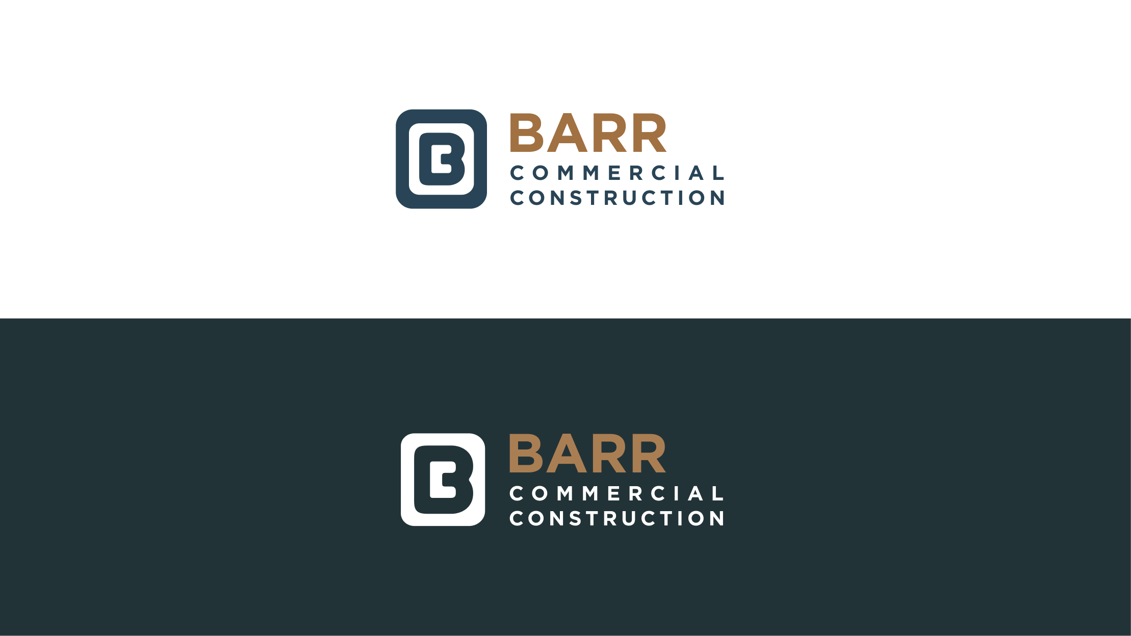
Designed the modular “B” monogram and repeatable brand pattern system
Established color palette, typography hierarchy, and usage standards
Created brand guidelines to ensure consistency as the company scales
Guided designers to create assets across signage, apparel, print collateral, LinkedIn, and website design
The Approach
Barr needed to look established and trustworthy while still feeling approachable and partnership-driven.
The identity centers on structure and precision. A custom “B” monogram forms a modular pattern inspired by architectural grids, supported by a refined teal and copper palette and clear typography and color rules that scale consistently from job sites to digital platforms.
The Result
Barr now presents itself as a credible, established construction partner that feels both experienced and approachable. The brand translates seamlessly from hard hats and signage to proposals and digital presence, reinforcing the company’s positioning as a team known for doing what’s right, doing it well, and being genuinely great partners to work with.
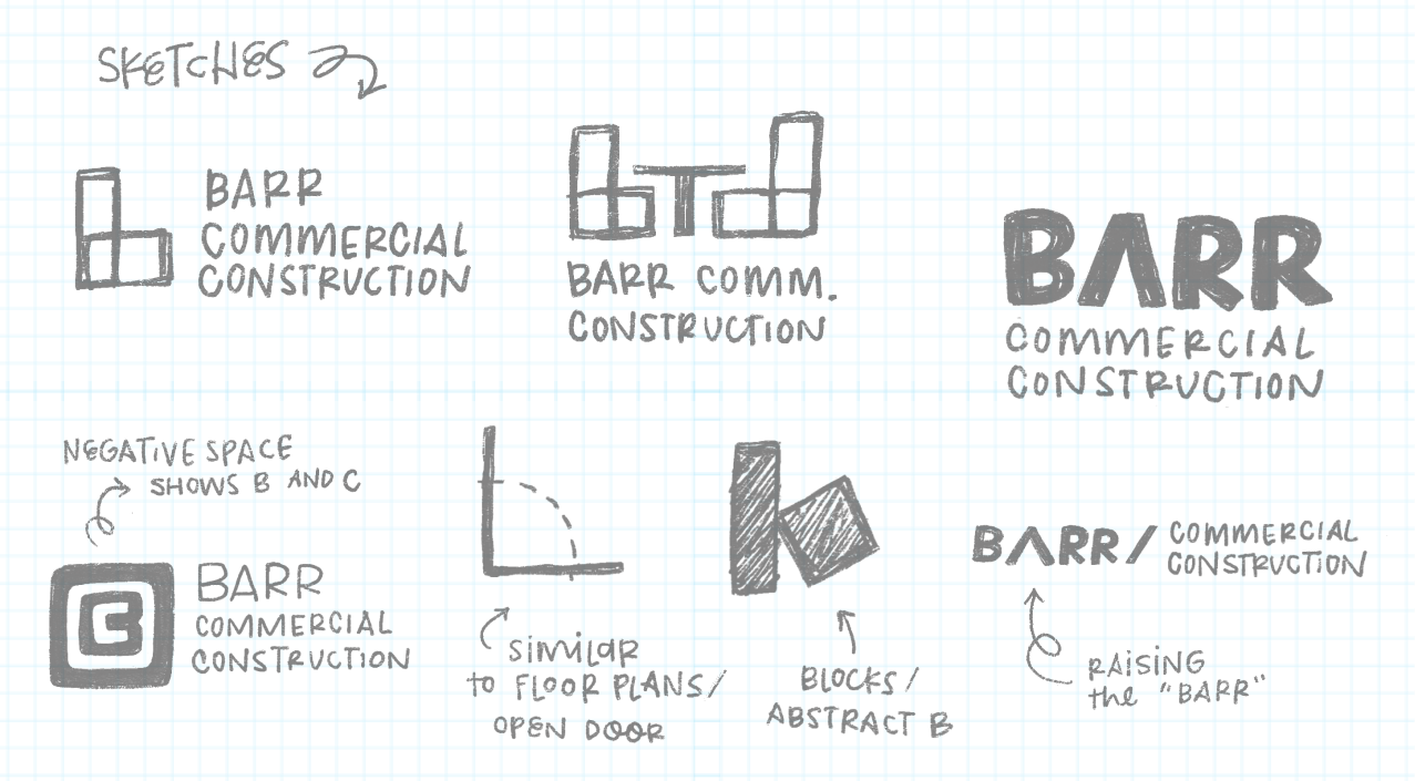
The Concepts
Early exploration focused on how the logo could subtly reflect the world Barr operates in. I sketched ideas inspired by floor plans, structural forms, negative space, and the idea of “raising the bar.” Many concepts explored how the letter B could be constructed from architectural shapes or simplified into a strong, recognizable mark.
These studies helped identify the direction that felt both grounded in construction and refined enough to support a professional, long-lasting brand system. The final monogram evolved from these explorations into a mark that feels structural, balanced, and highly adaptable across applications.
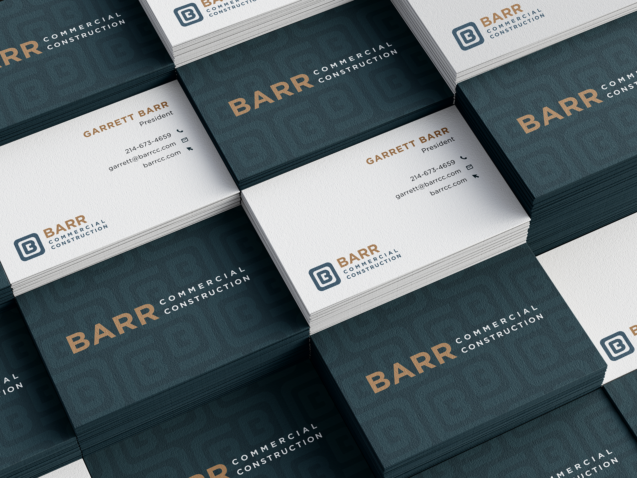
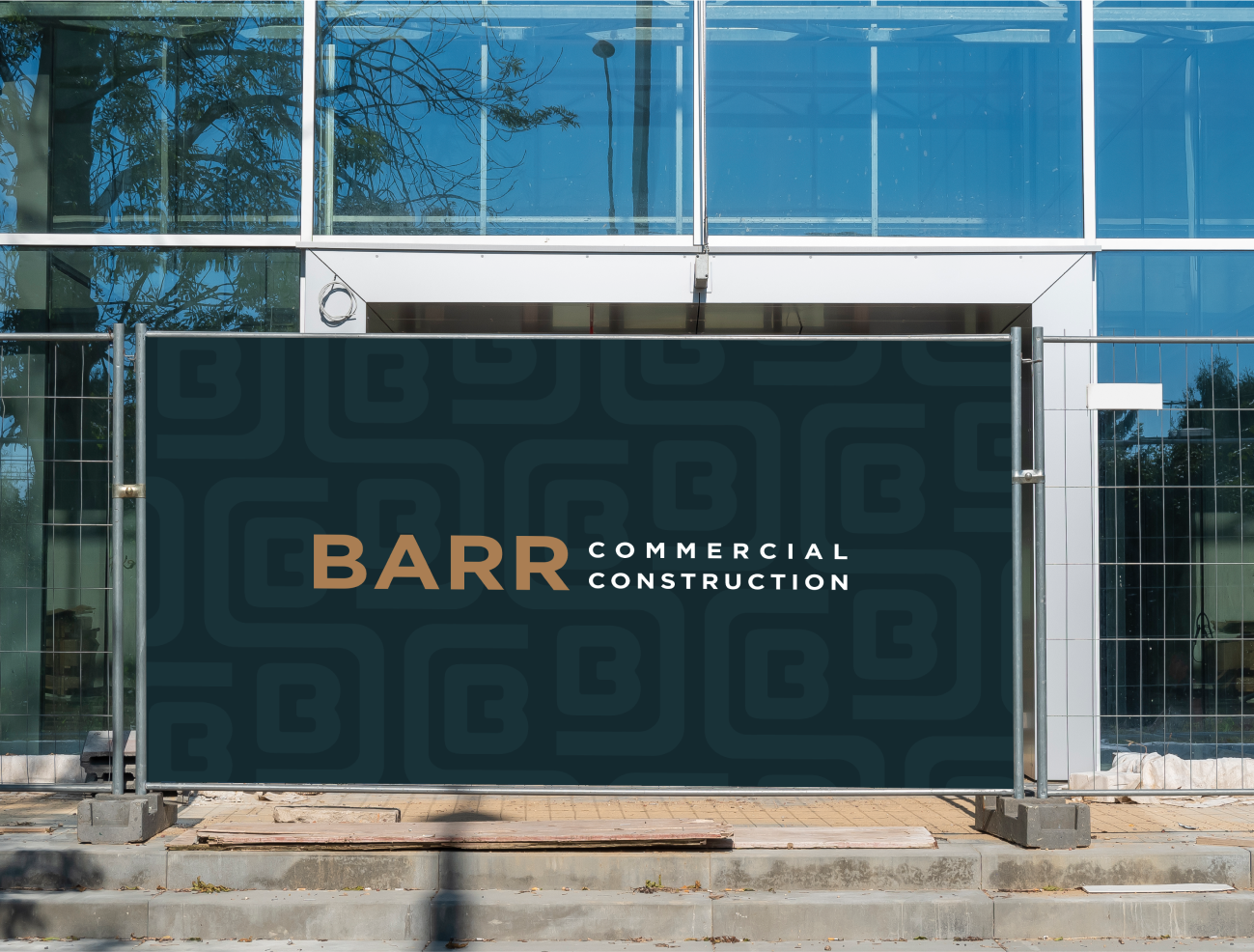
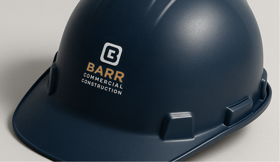
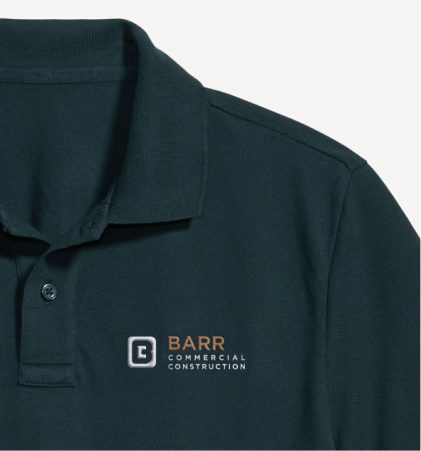
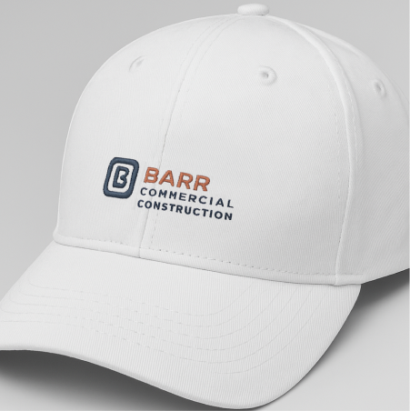
The Applications
The brand was designed to perform everywhere Barr shows up. From business cards and proposals to hard hats, apparel, signage, and the website, the identity remains clear, professional, and highly recognizable. The modular pattern, bold monogram, and defined color system translate seamlessly across physical and digital touchpoints, reinforcing consistency from the job site to the browser.